BP
Engaging 80,000 BP employees globally

Challenge
In 2011, BP asked us to help them engage employees around their new corporate values and behaviours. Getting all 80,000 people to feel proud of their organisation is never easy – especially on the back of one of the most public crises in recent years.
However, the expertise and dedication of the vast majority of BP individuals hadn’t changed overnight. The people on the ground were as committed as ever. Their expertise, professionalism and long service were things the whole company could still be hugely proud of.
Approach
• We embarked on a discovery process to explore how BP’s values were perceived, and how they should be communicated. We examined the language and communication techniques to be used – and those to be avoided.
• Our employee engagement campaign centred around a few key principles developed as part of our discovery process. These shaped the campaign creative and the design of every employee interaction.
Strategy
We carried out focus groups and interviews with 200+ employees to identify their thoughts and beliefs around the BP brand.
We used gamification to bring different issues to life, creating games for people to play and films for employees to debate. These reactions helped us identify how BP should be communicating its values in the future.
A global campaign
This was a global campaign that needed to appeal to every employee. It had to capture the sentiment in the business and the intent of BP’s values. We engaged with employees in New Zealand, Africa, India, the European Union, the UK and the USA through a combination of online and offline discussions.
The human truth
We always look for the simple human truth in any project. We discovered that customers love the people of BP but had lost faith in the brand.
We realised there were still very strong relationships between BP’s people and customers. We had to promote the people, bringing their achievements, beliefs and honest reactions to the forefront of the values roll out.
Work
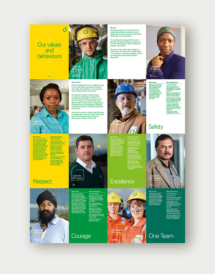
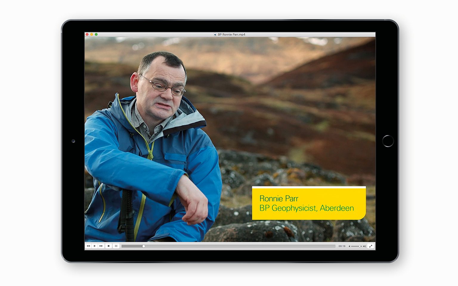
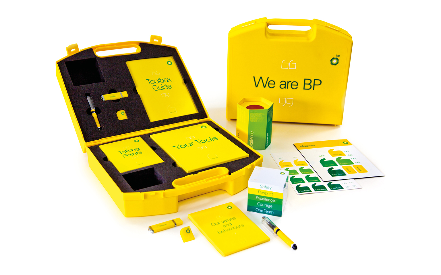
We created a framework for a new campaign that put BP’s people at the heart of all their communications – celebrating their work, their faces, and their stories. Using film, we shared employee stories, supported with environmental branding.
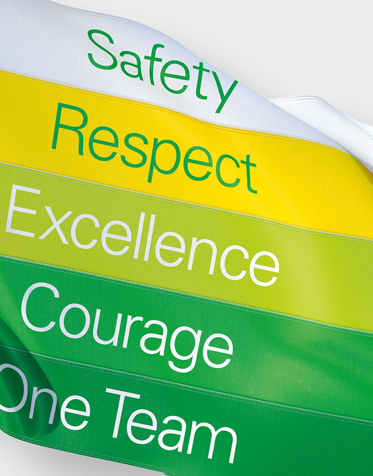
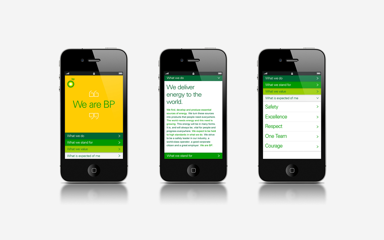
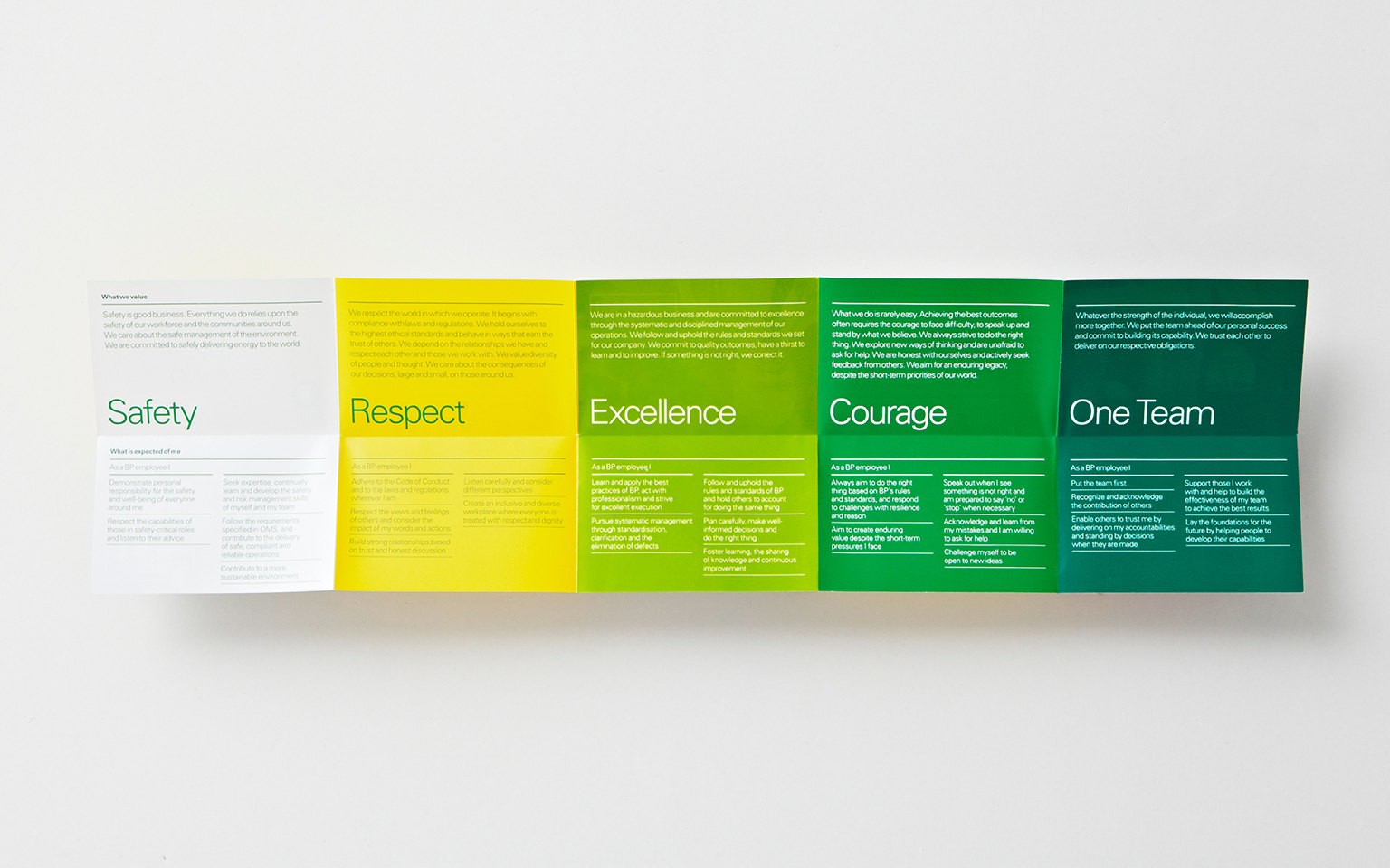
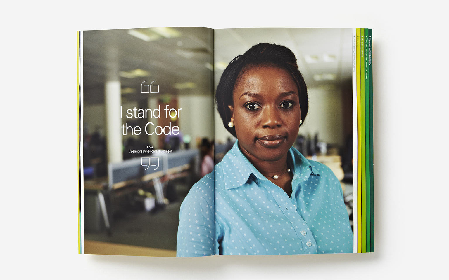
BP’s values were promoted in engaging ways, including ‘made-easy’ animations and quick reference guides to the five new values and the behaviours associated with each of them. For the first time, we shot individuals looking straight at the camera, explaining why they – and everyone at BP – should be proud of what BP people do.
We also applied this thinking to the Helios Awards that are run inside BP, and to the company’s code of conduct. These were just two of the employee experience touchpoints where we brought BP’s values and behaviours to life.
Outcomes
More Case Studies

Creating Values for Genius Sports
Getting the language right
Colt
Attracting Women in tech with Colt Technologies

BP
A refreshed language turning values into beliefs

NatWest Group
A learning narrative to inspire employees