Creating a brand to accelerate the progress of brain research
The Team rebrand Brain Research Trust, developing a new purpose and story identity, website and film.
One in five people in the UK – over 12 million people – have a neurological condition, with someone newly diagnosed every minute.
Brain Research Trust was founded in 1971 with the purpose of funding research into neurological conditions at UCL Institute of Neurology. The charity has awarded over £50 million in grants to the Institute. More recently the charity changed its charitable objectives to become a national funder of neurological research. It is the only charity to fund research that could benefit hundreds of brain conditions, giving the opportunity to improve treatments across diseases and ultimately speed up cures.
Brain Research Trust recognised that it needed to develop its brand purpose, story, visual identity and tone of voice in order to support its new strategy and the changing of its objectives to fund centres of excellence throughout the UK.
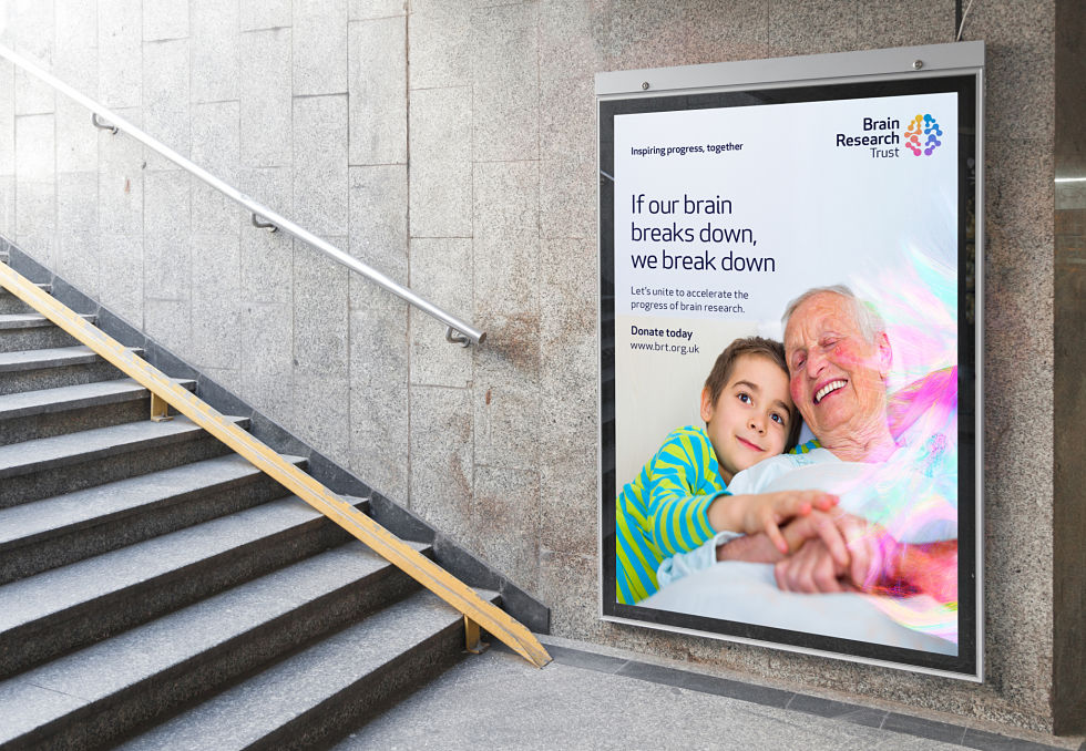
The Team reviewed the current brand straplines and knew the charity needed a story which would reflect their bold new corporate strategy. The rebrand with accompanying strapline ‘Inspiring progress, together’ is a strong call to action to scientists and families to unite.
Putting people’s real-life stories at the heart of the brand, saw ‘humanity’ defined as a value with an emphasis on improving the quality of life of people affected by one of hundreds of neurological conditions.

Observing that an increasing number of brands in the charity sector are becoming ‘fighting’ (beating, conquering etc.) in tone, especially the research-based ones, The Team wanted to produce an identity with an optimistic outlook and have created a multi-coloured palette, inspired by a tractograph brain scan by M. Chamberland and M. Descoteaux from the Sherbrooke Connectivity Imaging Lab (SCIL).
Images of brain activity can be awe-inspiring. Their beauty and complexity are fascinating and make a compelling brand asset. By overlaying a brain scan on to a photograph The Team have created a sense of intrigue to provide valuable stand-out.
The logotype is set in Apex Rounded font and follows the original logo’s composition; right aligned to signify moving forward. A new abstract brain symbol radiates positive energy.
The charity’s previous website had good content but was lost within an incredibly busy structure which encumbered the user with competing messages. In the new site, The Team wanted to tell the story of Brain Research Trust and the breadth of what they do in as easy and digestible a form as possible, and balance the serious and important nature of the research with authentic emotive human stories.

Caroline Blakely Brain Research Trust CEO said:
“We briefed The Team to review our brand and to create something that would support and drive our ambitious strategy for growth. Our new look and feel is warm and engaging and brings a human element to our medical research. It gives us the tools we need to progress as a national charity, funding the best neurological research in the UK.”
Dan Dufour, Brand Strategy Director at The Team said:
“The brain is the most complex organ in our body. It weighs just 3lb, yet it controls our emotions, senses and actions. So when it breaks down, we break down. It doesn’t have to be this way. We identified an opportunity for a brand with humanity, unity and positive energy; a brand to accelerate the growth of a great charity”