Helping The Stroke Association charity rebrand and lead the fight against stroke
Every year, around 150,000 people in the UK have a stroke. That’s one person every five minutes, making stroke the third most common cause of death in the UK. Our job was to help The Stroke Association get the recognition it deserves.
We wanted to create a visual style and design approach that matched the amazing experiences of the thousands of stroke survivors who have had use of the charity’s wide-ranging services. However, it currently only helps half of all survivors and wants to do more. The charity wanted to be seen as everyone’s ally in stroke, their purpose to “lead the fight against stroke”.
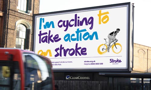
Our approach was to capture this internal drive for a more confident outward voice and develop a brand and identity which reflected their fighting spirit. “Everything we do is about taking action against stroke” and it is this thought that became the catalyst behind the new identity.
Part of the solution was to bring a confidence to the writing style so we teamed up with Dalton Maag to create a specially commissioned typeface that offered a distinctive characteristic to the identity. We started off by setting up a workshop and asked everyone at The Team, as well as the client, to write a variety of words with a paintbrush, a technique commonly used to help rehabilitate stoke survivors. The chosen lettering style was then refined by the Dalton Maag type designers, and expanded into a large character set.
“It is easy to assume that someone simply starts writing out a number of characters and that would be it,” says Bruno Maag. “During this process our designers first wrote out each character on paper, using the same tools and mimicking the writing style before digitising and refining the character. We continuously supplied The Team with Beta versions of the font so the designs could be tested within a live environment.”
The finished font was named ‘Action’ and consists of two font styles, Regular and Display, each specifically created for their respective usage environments:
“As fonts scale linearly, some of the distressing inherent in a brush stroke would look forced and made-up. The Display version addresses this issue by fine-tuning all the details so that even at very large sizes the font feels as if it has been hand-drawn.”
The primary use of Action is headline styles on marketing materials such as posters, press ads, leaflets and brochures, newsletters and banners. All lowercase characters have three variants to provide a smooth, natural connection to the adjoining letter. This also creates variation within the style, reflecting actual handwriting.
Action was also used to create the logo. This bold, active font will help the charity stand out from the crowd and be better known and understood, amplify their voice, attract more supporters to raise more funds and, ultimately, build a movement that will take action against stroke.