What I learnt from typography in the 90s
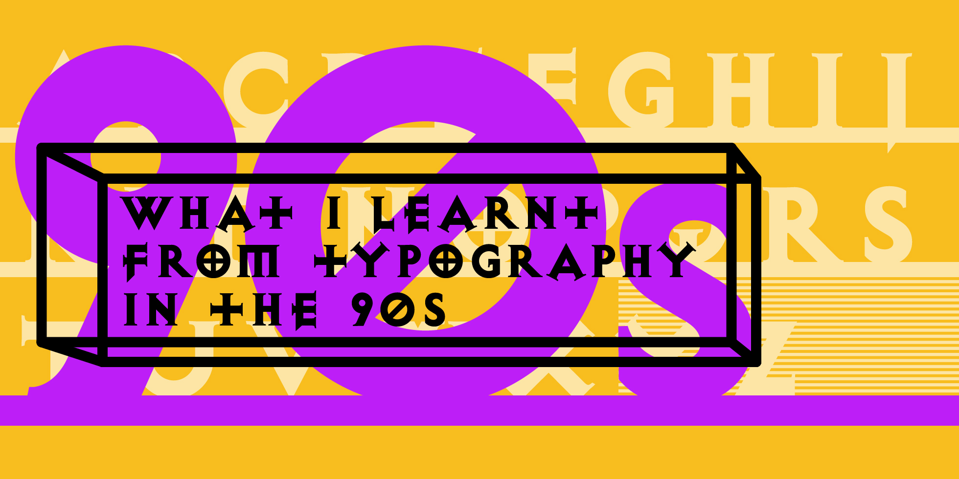
Typography in the 90s was spectacular, expressive and powerful. Senior Designer Simon Mannering blogs about the typography and typographers who inspired him from the 90s.
I was at art school in the 90s. I did a foundation course at Chelsea College of Arts in 1993 and wound up a year later at Glasgow School of Art.
Typography was a big deal when I studied graphic design. I’m not sure if it is still like that at art schools around the country, but in the 90s Typography was the sexy thing for graphic designers to get into. Émigré was in full swing, Neville Brody was an 80s superstar, Raygun magazine rose and fell, and design students like me got to play with type on a computer for the first time. It felt like everything that had previously been established was up for grabs. Designers and typographers, seduced by technology were driven by the hunt for new forms, it’s what got us going in the 1990s… experimentation, reinvention and destruction. We wanted to break all the rules, we just didn’t have a clue what those rules were (yet).
Probably the book that most of us young upstarts first purchased in our excitement to see what others were doing was ‘Typography Now’ which was first published 1989 and followed up with ‘Typography Now Two’ in 1996, both edited by Rick Poyner and with art direction from Jonathan Barnbrook.
Nestled into a tiny corner of the forward section written by Rick Poyner is a quote from Tobias Frere-Jones: “The new ability has become the new aesthetic… like the arabesque of the 1880s and the swashes of the 1970s, the contortions of the 1990s will fall out of favour, but not before showing us what the tools can do”.
The exercise of ranking the top typographers of this era seems futile and pointless to me. But what I would like to do is share the five typographers that mattered to me, and what I learnt from what I saw them doing, and what I learnt from what I heard them saying.
Five typographers that I learnt from in the 90s
David Carson
Rule #1: Be expressive
I somehow feel that David Carson was the right designer at the wrong time for me. He wanted you to forget all the rules, but as a first year Graphic Design student I didn’t know what rules to forget. I hadn’t read Die Neue Typography; I didn’t know who Massimo Vignelli was and I had never had to design an annual report or a signage system. However, Carson was a professional surfer, and I was (and will always be) a skater. His grungy compositions made perfect sense to me. I had been reading skate mags including ‘Transworld Skateboarding’ which David art directed for around a decade before I picked up my first copy of Ray Gun in 1992. Ray Gun is what he is more widely known for, he still runs a studio today, and creates work in that distinctive style that had so many imitators, but Ray Gun was his moment.
In Ray Gun I witnessed typographic obliteration. It was more than a deconstruction; it was a total reinvention of how type could (and some may say should) be used. I think David taught me to break rules, even the ones I had not yet learnt or spent any time testing. He showed me not only how to be expressive with type, but more how to be irreverent with it. There was also a massive element of the medium being the message. Computers were around, but we didn’t get to play with them until the third year of our degree course. But we did have photocopiers… and fax machines, and grant enlargers, and bromide and Letraset. Relics handed down to us from a more mechanical era. Carson’s warped and shredded free-form layouts captured this imperfect technological transition perfectly.
Jonathan Barnbrook
Rule #2: Look back
I met Jonathan a couple of times during my second and third years at Glasgow. I designed a poster for his Lecture at the school and had a few drinks with him in the GSA Student Union. He is a good six years older than me, so he would have been in his mid-twenties when he dropped by. He spoke about the latest typefaces he designed including Bastard, Exocet and Manson. He also mentioned the book he was designing with Damien Hurst. But for me, more interestingly, he spoke about how he was inspired by the typography of gravestones, and how he used to take wax rubbings of the arrangements on the headstones.
Jonathan embodies reinvention. His use of gothic black letter, ornaments and illuminations are the hallmark of someone who loves the history of typography. Fonts like Bastard, Exocet and Manson (now called Mason) have the aroma of medieval manuscripts and carvings. But the reinventions feel modern and expressive. Barnbrook knows that it is not enough to reinvent what is all around you, you need to get eclectic and diverse if you want to differentiate.
Jonathan embodies reinvention. His use of gothic black letter, ornaments and illuminations are the hallmark of someone who loves the history of typography.
Hamish Muir and Mark Holt – 8vo
Rule #3: Craft
Between 1986 and 1992 8vo published eight editions of the now infamous magazine ‘Octavo’. The rules were these: A4, 16pages, trace cover, one typeface family, and only ever eight issues. Although 8vo lasted from 1984 until 2001 and produced a varied array of excellent work, it was Octavo that got my attention. The eight issues were all designed without the aid of any DTP software, although you would think it was all designed on a computer. 8vo wanted designers to break free from the ‘tyranny’ of the big idea and start to explore typographic form as primary means of expression. 8vo had the opinion that the 80s ‘Smile In The Mind’ generation had simply relegated typography to a footnote position on their ads and brand identities. Octavo aimed to break that perceived tradition.
8vo created the freedom you can only get from a really tight brief. By giving themselves such tight restrictions, 8vo were able to create something brilliantly different. Using pre desktop publishing techniques 8vo pushed paste-up production about as far as it could go. The complexity of composition on show in Octavo would be impossible to achieve on an Apple Mac for several years to come. The craft and mastery over technique was awe-inspiring and shone a light on the sloppy experimentation of all the Carson imitators of the era.
Ian Anderson – The Designers Republic
Rule #4: Look forward
For me, The Designers Republic stood out in the 90s. This is obvious when you take a look at the cover of Émigré 29. They were a central part of the conversation, but somehow removed from it. Typography of that era can retrospectively be thought of as grungy and messy, but the aesthetic of TDR was anything but. Founded in 1986, the forms felt futuristic and exotic, drawing on a kind of hi-tech Tokyo influence. Anderson was heavily influenced by Russian Constructivism and had plenty to say about consumerism, which explains the pure impact of the earlier stuff. TDR had some real commercial penetration, working with Sony on the futuristic racing game ‘Wipeout’ as well as all the Warp Records artists like Apex Twin, LFO, The Orb and Pop Will Eat Itself amongst many others who clearly didn’t know what they were getting themselves into.
Putting the politics of TDR to one side (when I stuck my UFO Orb posters up in my student flat that wasn’t important to me), I could feel the future. The look was progressive and exciting, colour was bright and poppy, and the shapes were precise and geometric. Glasgow in the 90s had a buzz around it, everyone was wearing silver and it felt like we were about to take off in a giant millennial spaceship. TDR captured that zeitgeist and delivered it to its young captivated audience. If Carson was destroying the past, then The Designers Republic were building the future.
View the Designers Republic website here.
Phil Bains
Rule #5: Reinvent
Short anecdote… In my first couple of weeks at Glasgow I had to present a 5-minute talk about a typeface to my whole year in one of our small lecture theatres. This terrified me. However, I pulled myself together and settled on a talk about the typeface ‘Can You’ by Phil Bains. I got so worked up about it I decided to take some advice on relaxation techniques. I ended up being so relaxed, that halfway through the talk I actually fell over.
Phil as a typographer is a believer in structure, often using mathematics and geometry to create harmony in composition. Although he was featured in the first copy of Typography Now you could easily argue that he didn’t really belong amongst all those other renegades. He is precise with his use and selection of letter forms, knowing exactly why a font has been designed a certain way and what its particular best use is. He is a great example of someone who is creating something new from something old. The font ‘Can You’ exemplifies playfulness in the hands of someone who knows what they are doing. By reducing Clarendon to its essential elements something new has emerged. Knowledge and mastery of typographic heritage gives us the power to tweak, tinker and modify our way to something unique, surprising and differentiating. Phil Bains taught me that.
Five typographers I learnt from outside the 90s
So that is how things started out for me at art school. Not a rule in sight. As it turns out it was very little training at all for a fast-approaching professional career as a graphic designer. I had to learn quickly. But it would be later on until I understood what a grid could really do for your design, how I could create rhythm on the page with a baseline grid. Discussions around accessibility were a long way off, but common sense stood in its place, this was also the case as far as user experience was concerned. Very little was spoken about that subject in design agencies until around 2005. I won’t get into the fact that Glasgow had a very concept driven degree curriculum. What would happen to my ideas if I could not express myself? But that is where I needed some further education.
So, who did I learn from? As far as typography was concerned, who knocked some sense into me? Of course, there was a plethora of creative directors and designers I worked with, but who were the folks I looked up to in the same way as those paragons of the 90s?
Massimo Vignelli
Rule #6: Become invisible
Vignelli said that people who liked Émigré did so because they had no education. I received my first copy of Émigré because I was undertaking a formal design education. Some may say that his approach to design is timeless, but it isn’t, but he did know what worked. Grids had been around a long time before Vignelli, from the Dead Sea Scrolls to the Bauhaus, grids were nothing new. But boy did he know how to use them. Along with a small selection of fonts. Vignelli reasoned that it should be the content, not the designer that screams for attention. And it was of course the idea, not the designer that should be at forefront of our audience’s mind.
Vignelli taught me that if you can recede as a designer and let the content shine through then your design work will take on a life all of its own.
Vignelli taught me that if you can recede as a designer and let the content shine through then your design work will take on a life all of its own.
Paul Rand
Rule #7: Be Honest
Rand understands that copy and image are one in the same. It is a marriage. One does not come before the other, but the combination of both create something more than the whole. He also understands the balance between typographic expression and function. In fact, it is no surprise given the success and proliferation of Rand’s output that he could almost be seen to be sat smack in the middle of all the design conundrums and contradictions that have vexed graphic designers and typographers for a century, balancing those contradictions and solving those conundrums.
I’d be happy to say any number of complimentary things about the visual style of Paul Rand, but what impressed me most was his honesty. I don’t think Paul was being brave when he did what he did, he was just doing what felt like an honest response to his client’s brief, but it is that level of honesty that demands the highest levels of bravery from all those that followed. His work was so blindingly different from what came before that he should, and is, considered as nothing less than a revolutionary.
Jan Tschichold
Rule #8: Order
I’m partly such a big fan of Tschichold because I dislike the Arts and Crafts movement so enormously. A movement that created such a massive ditch in Britain’s visual heritage that we have been struggling to climb out of it ever since. The impact of Tschichold and his modernist contemporaries was big, but not big enough in my honest opinion.
Tschichold’s early work was defined by ‘clarity over beauty’. But his work was beautiful. Perfectly balanced, single minded and highly considered. He not only pioneered the arrangement of type, but also set about revolutionising the design and publishing industry by advocating the standardisation of fonts and paper sizes. His book Die Neue Typographie was a manifesto of modernist design and an essential guide to clear communication. Published in 1928, the book leads the designer through a number of practical examples that show how Jan imagined the new world order should look. I remember the impact the solid black frontispiece had on me.
Tschichold went on to gradually soften his approach to layout and typography, going on to design the typeface Sabon and formalising the iconic Penguin logo and cover designs. But it is that early work expressing the ideals of the Bauhaus that had such earth-shattering consequences for 20th century typography as well as for me, trying to make sense of commercial graphic design.
Learn more about Jan and his work here.
Alan Fletcher
Rule 9 #Look Sideways
Having a stunningly attractive bookshelf has always been one of my life’s ambitions, and as a graphic designer, I’d like to think I have a pretty good shot at achieving that dream. So, in 2010 when I spotted a copy of ‘The art of looking sideways’ in Magma books in Seven Dials I couldn’t stop myself from handing over the relatively small amount of cash needed to buy such a chunky tome. And when I placed it on my shelf at home, it did look rather lovely. It had a pretty unique spine with what looked like part of an essay running sideways in black, with just the words ‘The art of looking sideways’ picked out in red. And there it sat, not doing anything other than looking wonderful for quite a good while. It was only when I started doing some freelance work a few years later in a studio off Oxford Street for a phone network that I remembered I had it, and what it looked like, and how something like that could work for my client.
Alan Fletcher is one of the most influential graphic designers in British history. He studied in the UK, moved to the US where he was taught by Paul Rand at Yale, married and then in 1959 came back to the UK to found Fletcher Forbes and then, eventually, Pentagram. His most famous book is over five hundred pages long and has at least as many visual ideas and treatments as that. The book has 72 ‘chapters’ on subjects as diverse as ‘value’, ‘taste’, ‘skill’, ‘space-time’, ‘protagonists’, ‘wordplay’ and ‘change’. I like to use the book a bit like a thesaurus, I pick a chapter and see what idiosyncratic nuggets present themselves. Each chapter is a diverse collection of thought and visual execution, type is expressive and works playfully with the imagery, creating visual puzzles or beautiful little ‘smiles in the mind’.
Great typography not only equals communication but can also equal emotion and experience. Sometimes we need to deliver what our clients have asked us for, but in a way they did not expect. Alan Fletcher shows you how.
Watch Alan Fletcher talking about ‘The art of looking sideways’.
Great typography not only equals communication but can also equal emotion and experience. Sometimes we need to deliver what our clients have asked us for, but in a way they did not expect.
Corita Kent
Rule #10: Be Vocal
Corita was the artist/designer and nun who showed me that nothing is ever really original. Her work has more recently been recognised as being amongst some of the most important of all the major pop artists, and it shows great contrast with her contemporaries such as Warhol, Blake and Lichtenstein. Like all great pop art, it borrowed and amplified common elements from the world around it. You can see the echoes of her work in low rent street art and graffiti, but also in the ancient and beautiful calligraphic expressions of the Middle East and Asia. But what I saw was how the spectacular 90s graphic expressions of David Carson had not been original in the way I had first supposed, and that was a Roman Catholic Nun living in California 30 years earlier who had already torn up the rule book, reinvented normal and expressed herself in the strongest visual terms she could muster.
Maybe you don’t expect a nun to be so loud, maybe you wouldn’t expect a nun to be so in-your-face with her politics, and maybe that’s why Corita was overlooked by so many for so long. She only ever undertook commercial work a handful of times, but when she did, she didn’t hold back. Otherwise she spent her time teaching others to not hold back. Saul Bass, Charles and Ray Eames, Alfred Hitchcock and Buckminster Fuller were amongst those who attended her classes, as well as many other aspiring minds. She knew how to use the power of typography to say what she had to say with power.
Our careers, and our lives could be described as a process of learning the rules and then knowing when to break them. But sometimes we break all the rules before knowing them, and I’m ok with that. Typography in the 90s was spectacular, expressive and powerful, it was something that reflected that particular point in time, and so may seem less and less significant as we all continue on our journeys into the future. But it is important not to lose sight of those lessons that our experience has taught us. Even if some of those lessons were sometimes learnt in reverse.