Workplace Wednesday: Using visual identity to create an innovative and dynamic co-working space
The Team joined forces with RBS and LOM Architects in August 2018 to transform Level 3 at 250 Bishopsgate into an innovative and dynamic co-working space. Find out how we designed their workplace visual identity to help redefine the relationship between work and play and capture the spirit of a dynamic co-working community.
In 2017, RBS identified an opportunity to vacate the whole of 280 Bishopsgate by the end of 2019 and move into a new space at 250 Bishopsgate in the City of London. The decision to move not only made financial sense, but also addressed a greater need – to significantly improve their working environment.
Part of the transformation included turning an old third floor meeting centre into an innovative new ‘co-working’ area with c.500 flexible work positions capable of supporting around 950 highly mobile workers in a collaborative modern setting.
The inclusion of a new ‘co-working’ area followed the successful trial of a concept ‘hub’ at 214 Bishopsgate and reflected a surge in demand for environments that provided knowledge workers with greater opportunities to meet and collaborate in a different, more dynamic ways than had been the case in a more traditional office environment.
With RBS and LOM we helped transform Level 3 at 250 Bishopsgate into an innovative and dynamic co-working space. We brought the vision to life through a visual identity that was applied to super-graphics, wallpaper, furniture, glass manifestations and wayfinding.
The concept
Our aim was to transform Level 3 into a vibrant destination that redefined the relationship between work and play and captured the spirit of a dynamic co-working community.
The ethos of the space was already well defined. Inspired by the way natural light moved around the building, LOM began the design process by establishing an overarching theme of ‘dawn, day and dusk’.
The design also used biophilic design principles to promote wellbeing through a sense of familiarity and comfort. Biophilic design is an approach to architecture that seeks to connect building occupants more closely to nature. Biophilic designed buildings incorporate things like natural lighting and ventilation, natural landscape features and other elements to create a more productive and healthy built environment for people.
The principles of biophilia and the theme of ‘dawn, day and dusk’ were then turned into a clearly defined concept that would inform the visual identity for the space as well as explain the impact it would have on those coming to work there.
The Team went on to create the concept of ‘habitats’. A habitat is defined as “the natural home or environment of an animal, plant, or other organism”. The concept was simple to understand and broad enough to define Level 3 as a destination like no other.

The visual identity
Nomenclature
Each workspace zone, communal space, landmark, scrum, meeting room, pod and kitchen is named using words derived from the natural movement of light, water, flora and air.
Words such as Rise, Dapple and Flow are familiar and comforting, and support our biophilic design principles. Some spaces – the Library, the Triangle and the Conservatory – are intuitively named as these names are familiar to our audience.
Colour
The comprehensive colour palette is defined by three core zones – dawn, day and dusk– plus the ‘green’ zone which covers the Conservatory, Garden Cafe and Weather Garden. Each zone has its own palette of natural shades ranging from deep to light, and tones from fresh to earth.

Photography
Epic photographic images of the natural world are used to create super-graphics around the space. Each zone has its own image library made up of a selection of skyscapes, landscapes and details. The images pick up on shades from the colour palette.

Graphic landscapes
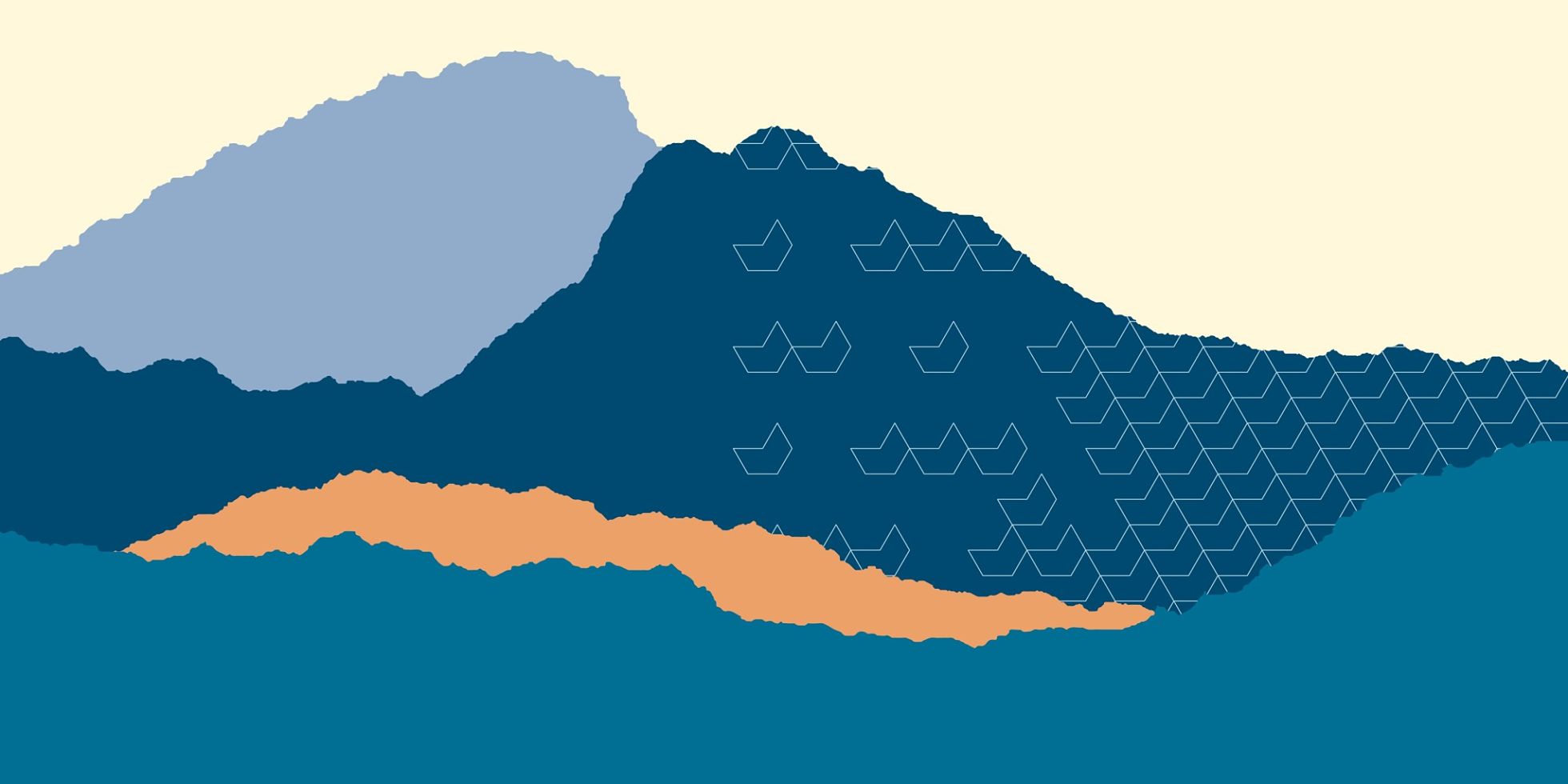
Graphic landscapes are modular graphics that can be adjusted to fill any space. They can be used in conjunction with graphic patterns and use colours defined by the four zones.
Graphic patterns
Graphic patterns are versatile patterns made up of shapes taken from the NatWest icon. Each pattern reflects a movement made in nature, e.g. drizzle, grow, flock and bloom. They add movement to the space and can be used in several ways: overlay them onto photographic images or graphic landscapes to add a layer of texture; use as a repeat pattern for wallpaper and manifestations; or take smaller sections and dot them about as ‘tags’ on furniture.
Typography
Our carefully crafted outline font was adapted from the RBS house font RN House Sans and is designed for use in headline messages.

Iconography
The icon set is crafted to reflect the open characteristics of the outline font and the delicacy of the graphic patterns, whilst being robust enough for use in wayfinding and signage.

At The Team, we specialise in developing brand strategy and optimising workplace brand experiences. Whether you are redesigning your current workspace or moving into a new office, we look at how you can engage employees and encourage new ways of working by making the brand work in your space: through communications, actions, leadership and environmental design.

