NatWest Group
A new dawn for co-working
Challenge
In 2017, RBS (now NatWest Group) identified an opportunity to create an innovative new co-working space for its NatWest employees, capable of supporting around 950 highly mobile workers in a collaborative modern setting. This meant vacating the whole of 280 Bishopsgate, by the end of 2019, and moving into a new space just a few doors down at 250 Bishopsgate.
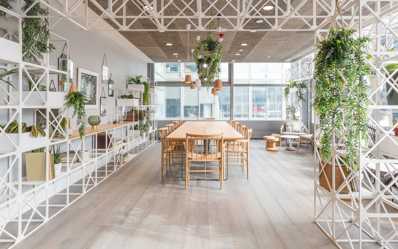
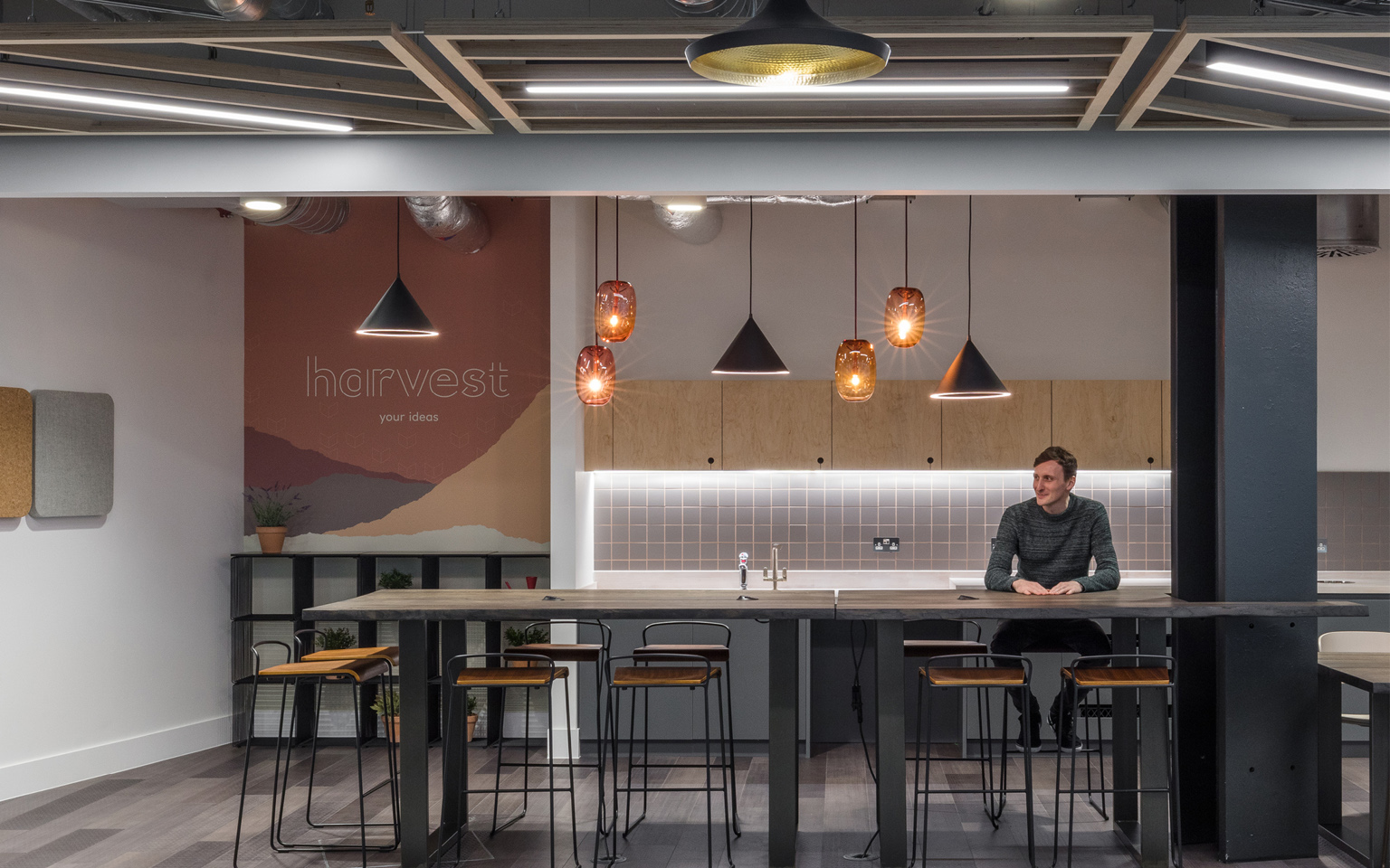
Part of the transformation included turning an old third floor meeting centre at 250 Bishopsgate into a dynamic new co-working area that offered around c.500 flexible work positions. Working with RBS and LOM Architects, our aim was to transform Level 3 into a vibrant destination that redefined the relationship between work and play and captured the spirit of a dynamic co-working community.
Solution
We created a new visual identity that was applied to super-graphics, wallpaper, furniture, glass manifestations and wayfinding in the new space.
An overarching theme of ‘dawn, day and dusk’ was established by LOM Architects. Inspired by the way natural light moved around the building and biophilic design principles (connecting building occupants more closely to nature), the space promotes wellbeing through a sense of familiarity and comfort.
The overarching theme helped us to define the visual identity concept of ‘habitats’ – the natural home or environment of an animal, plant, or other organism.
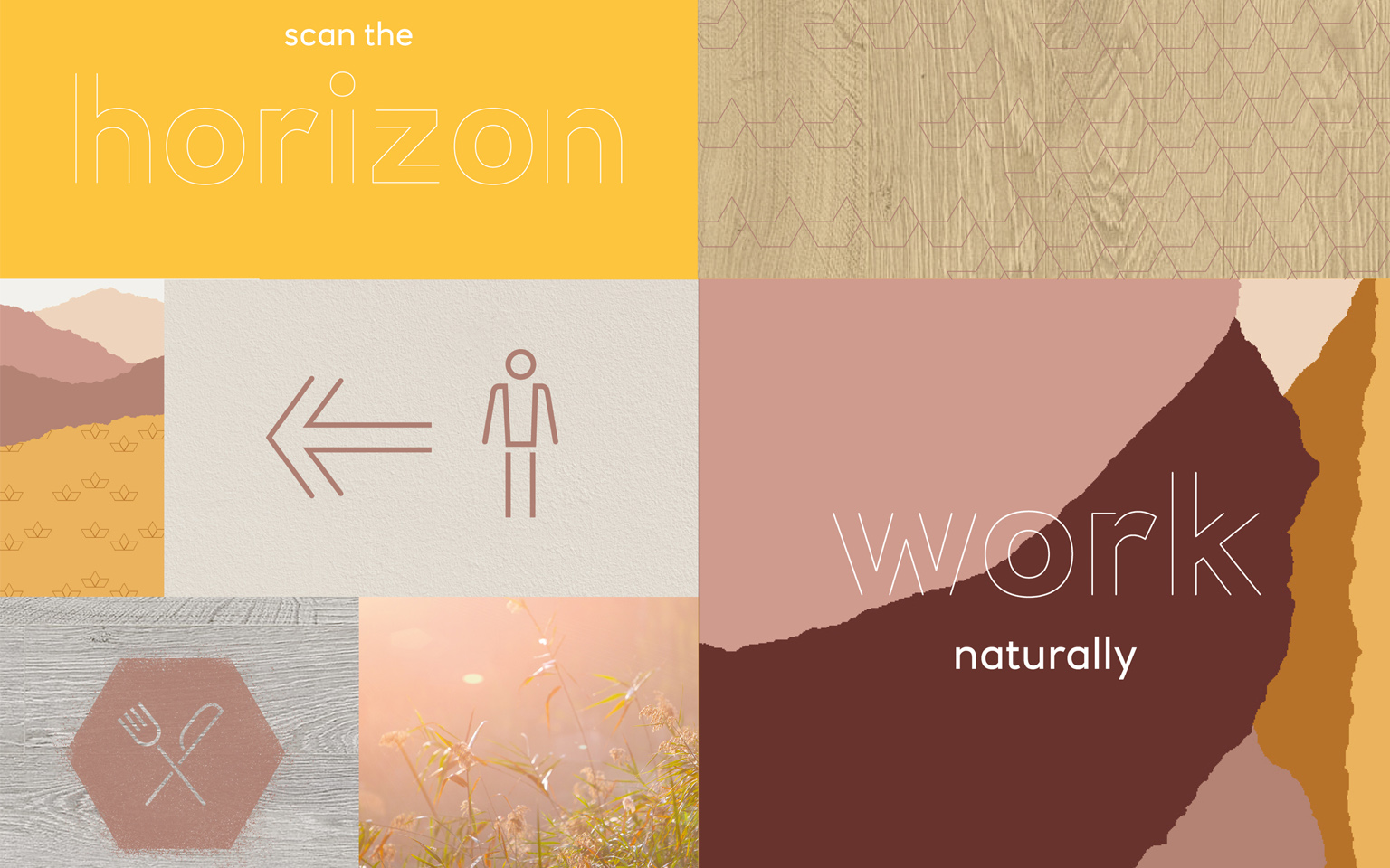
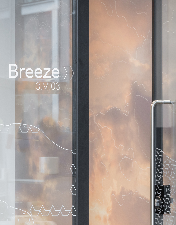
Words that describe the natural movement of light, water, flora and air – such as Rise, Dapple and Flow – are used to describe workspace zones, communal spaces, landmarks, scrums, meeting rooms, pods and kitchens. They sound familiar and comforting and support our biophilic design principles.
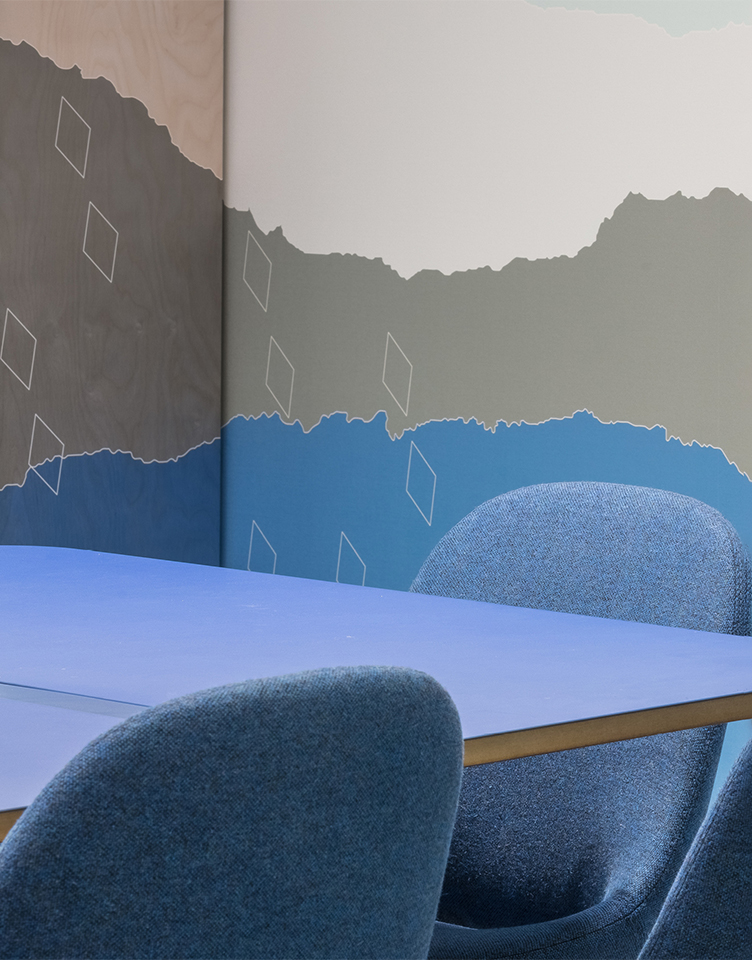
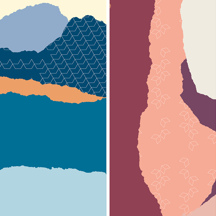
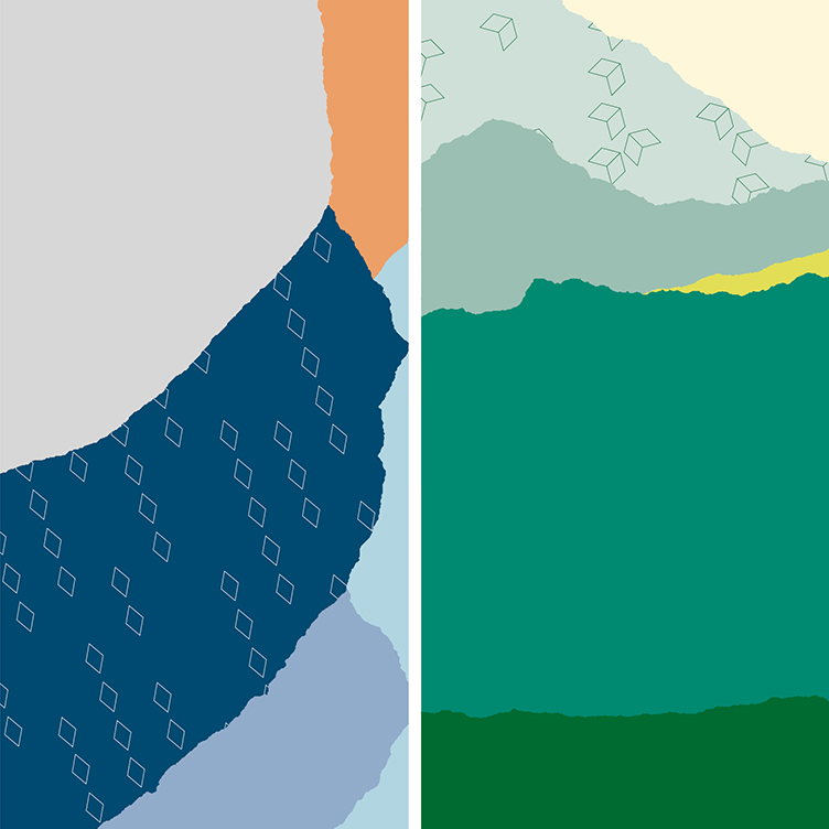
The comprehensive colour palette is defined by four core zones – dawn, day and dusk – plus the ‘green’ zone which covers the conservatory, garden café and weather garden. Each zone has its own palette of natural shades ranging from deep to light, and tones from fresh to earth.
Images of the natural world are used to create super-graphics around the space. Each zone has its own image library made up of a selection of skyscapes, landscapes and close-ups.
We designed modular graphic landscapes that can be adjusted to fill any space and be used in conjunction with the graphic patterns and colours defined by the four zones.
The graphic patterns add movement to the space and can be used to overlay photographic images or graphic landscapes – as a repeat pattern for wallpaper and manifestations, or as ‘tags’ on furniture.
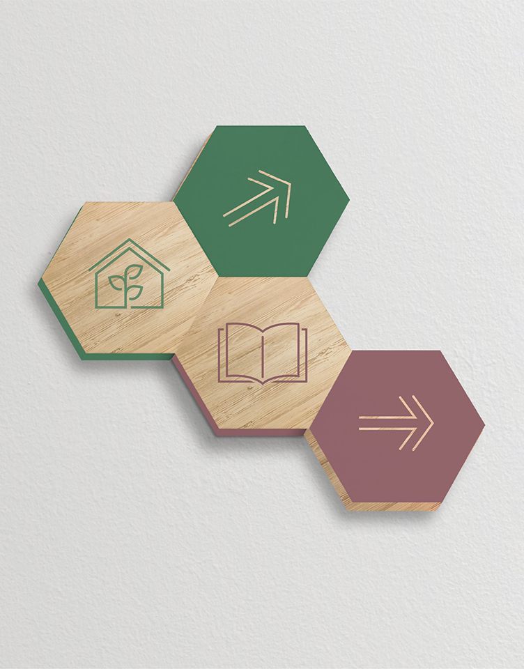
They’re made from shapes taken from the NatWest icon. Each pattern reflects a movement made in nature, e.g. drizzly rain, plant growth, birds flocking and flowers blooming.
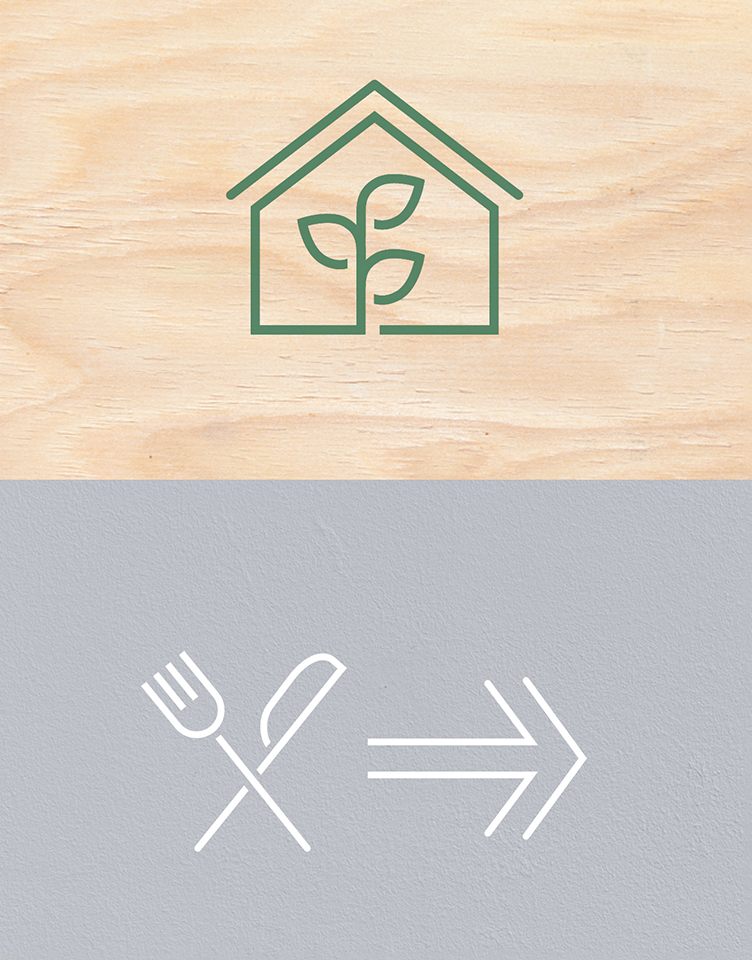
The icons echo the open characteristics of the outline font and the delicacy of the graphic patterns, while being robust enough for use in wayfinding and signage.
The house font was carefully crafted into an outline font to reflect the openness of the space and is designed for use in ambient messages.
More Case Studies

Creating Values for Genius Sports
Getting the language right

Colt
Attracting Women in tech with Colt Technologies

BP
A refreshed language turning values into beliefs

NatWest Group
A learning narrative to inspire employees