Blind Veterans UK
Transformation at Blind Veterans UK
Challenge
St Dunstan’s was founded in 1915 to provide lifelong support to those blinded in the First World War. In 2012 the charity changed its name to Blind Veterans UK.
Lost in a sea of red, white and blue, with mixed messages, The Team were called in to refresh the brand, exposing the brand truth and creating greater differentiation in the marketplace.
Solution
Research showed that members and carers valued the strong sense of community of the brand, whilst potential supporters needed tangible evidence of the life-changing transformation to consider support.
This led us to the brand personality of Team Transformation with the supporting values of Caring and Trustworthy, Pioneering and Celebratory.
Why Team? Because, as a strong community, the charity is one team of veterans, carers, friends, family, specialist staff, volunteers and supporters. And Transformation? Because the charity’s expert rehabilitation and training programmes transform the lives of veterans.
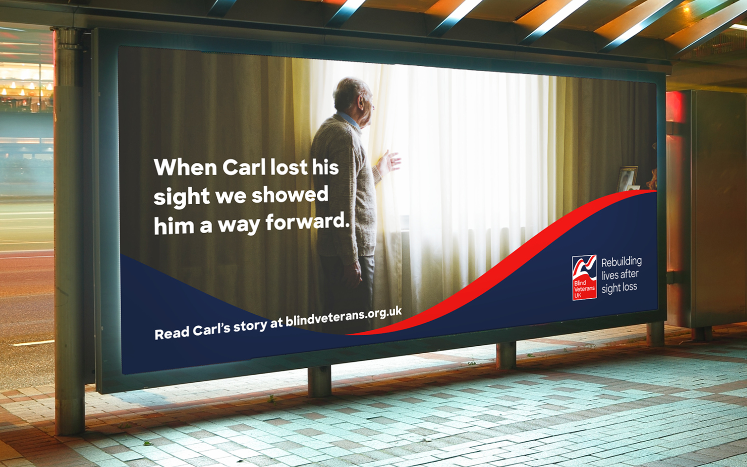
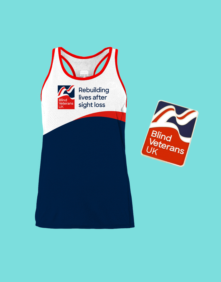
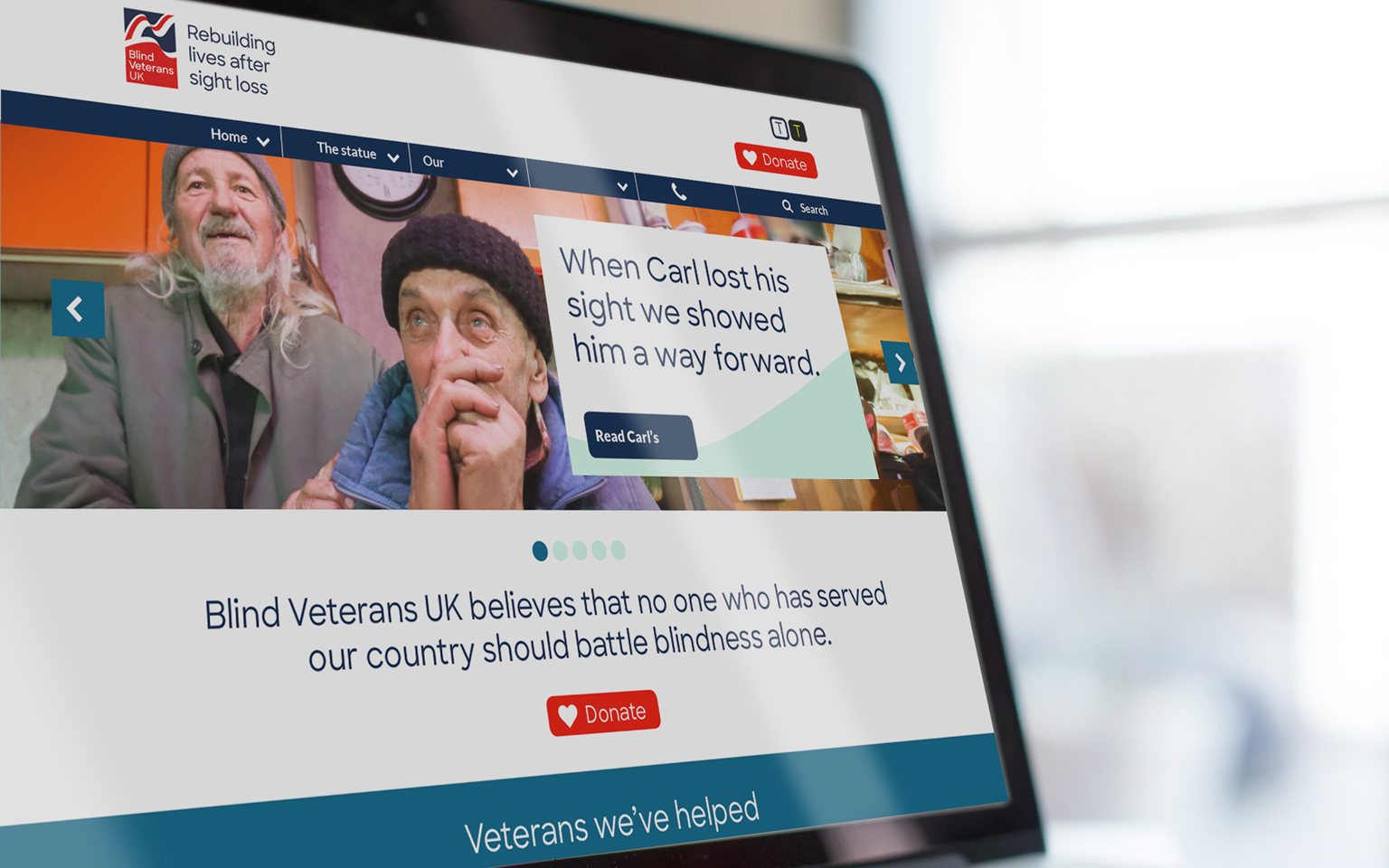
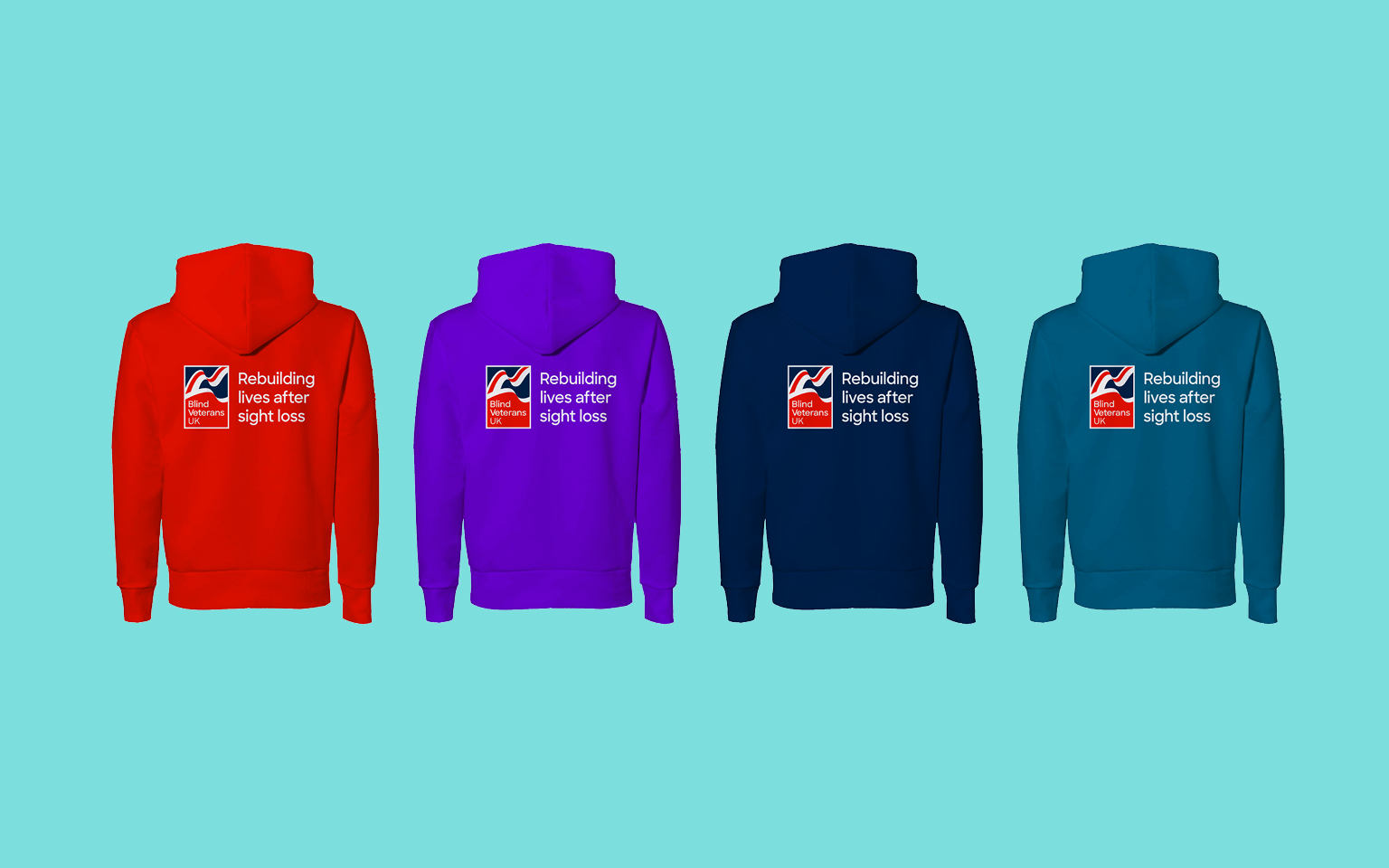
A refreshed visual identity focused on achieving greater clarity and accessibility. This included a new headline font, Sharp Sans, created with best practice accessibility principles front of mind.
The movement of the Union Jack flag within the existing logo has been developed into a graphic device which adds energy and momentum to the brand, as well as enabling a graphic system which aids consistency, making the Blind Veterans UK identity more instantly recognisable.
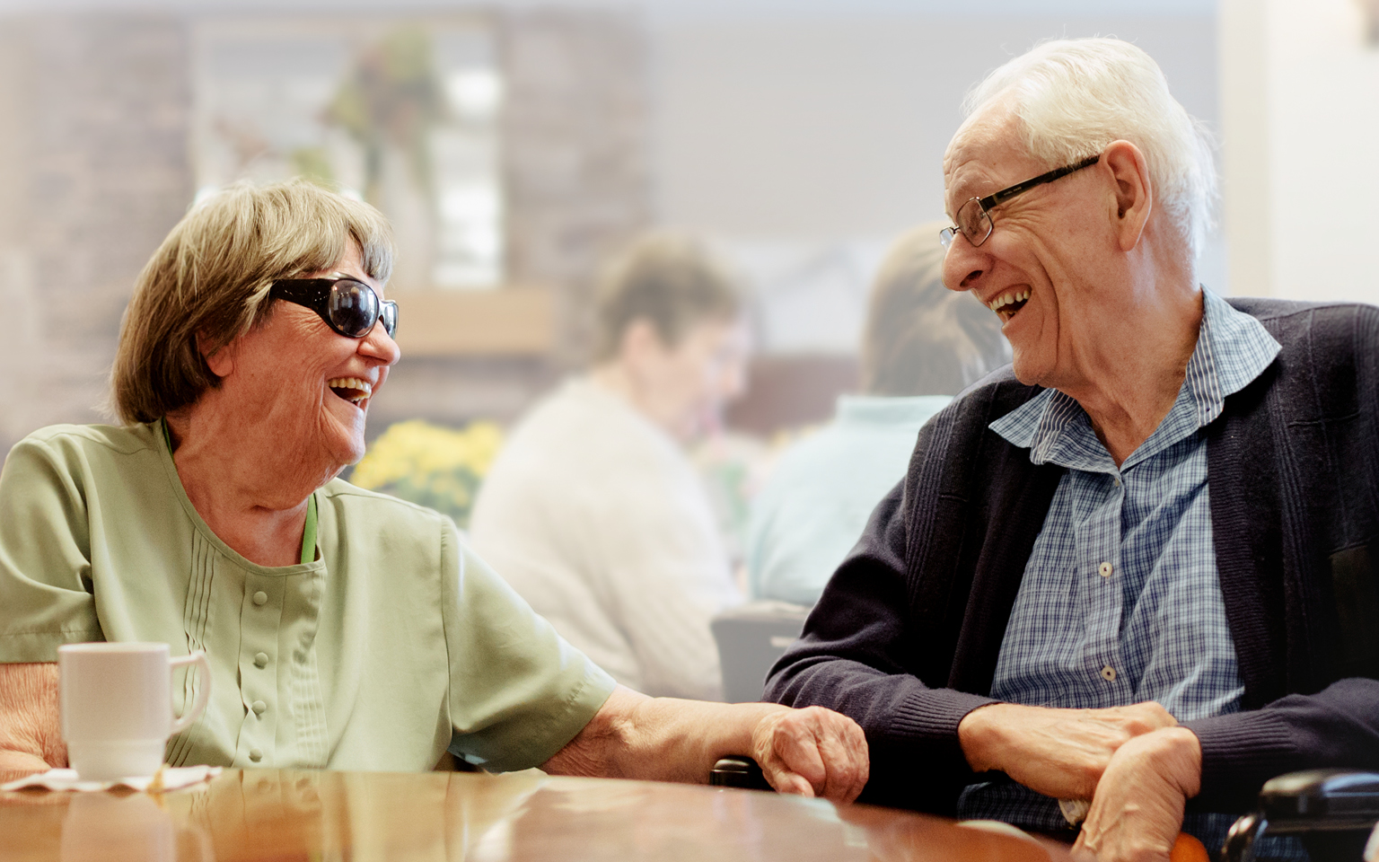
Shades of teal, mint and grey have been added to the existing red, white and blue to give stand-out and to make the brand easier to navigate. While, a new photography style has been established to help show veterans’ stories from isolation to transformation.
More Case Studies
IBM Consulting
Repositioning and creating brand value for IBM
CLAPA
Redefining the voice of the UK cleft community