Southeastern
‘Safeeastern’ campaign: Reassuring passengers of safety measures
Challenge
Waiting for the train on a cold and wet station platform is never the most appealing prospect. Add social distancing, mask wearing and hand sanitising into the equation, and travelling by train becomes quite a daunting prospect.
But for many people who can’t always work from home, the train provides a vital transport link. Southeastern wanted to send a big message of reassurance to these passengers, and let them know how they’re going above and beyond to keep their trains and stations as safe as possible.
Approach
• We used behavioural science to examine a range of tools or techniques that could help to make our messaging ultra-reassuring and something anyone travelling by train could trust.
• From this, we formed three key principles that drove our creative solution: be transparent to build trust; have empathy with passengers’ concerns; and vitally, make it about them, not us.
• We also had to find a creative expression that stood out from a myriad of other safety messaging flooding stations and our airways.
Strategy
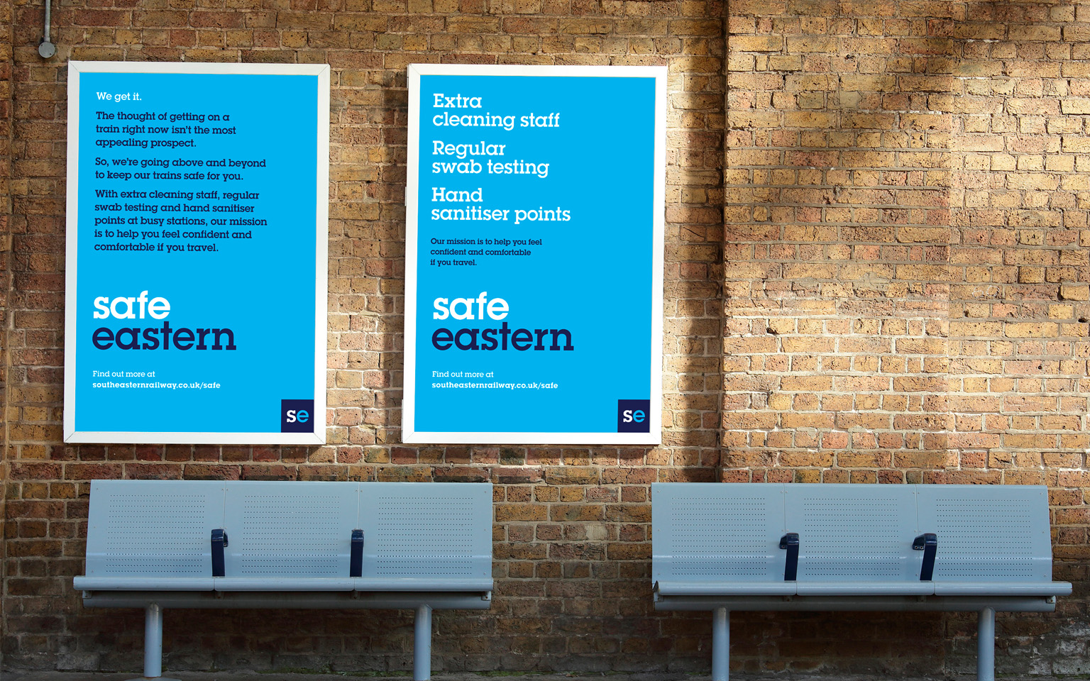
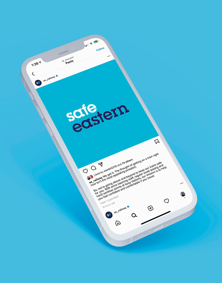
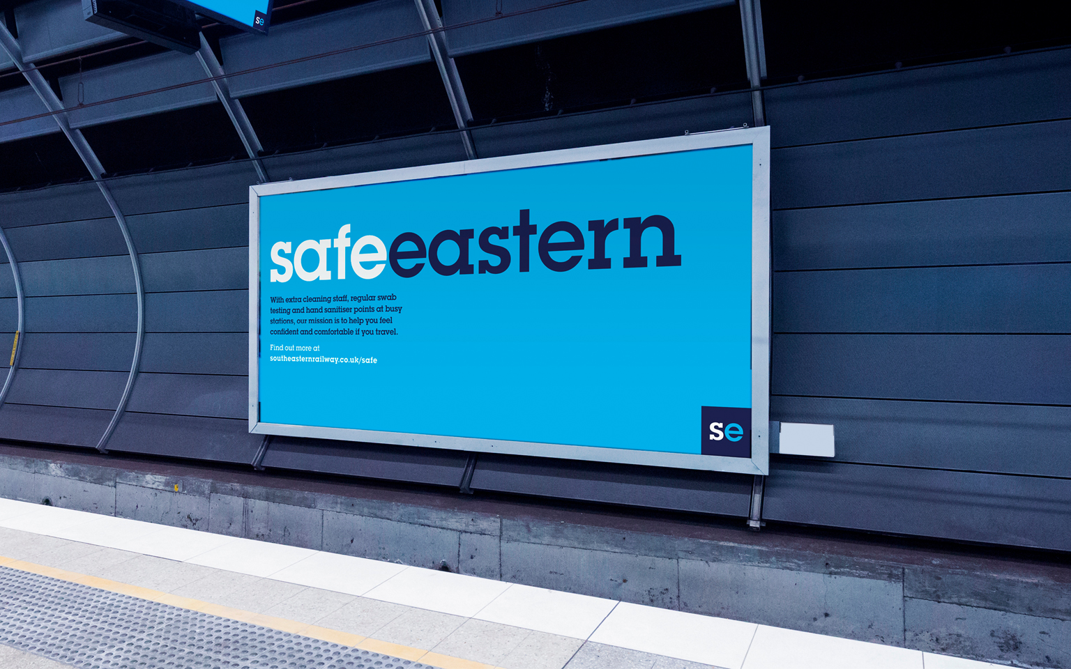
Our creative approach was driven by our aim to create greater empathy and a rapport with passengers. We were upfront and transparent about their concerns, tackling them head on with reassurance and warmth, sharing very specific details about the measures being taken to safeguard the safety of anyone travelling.
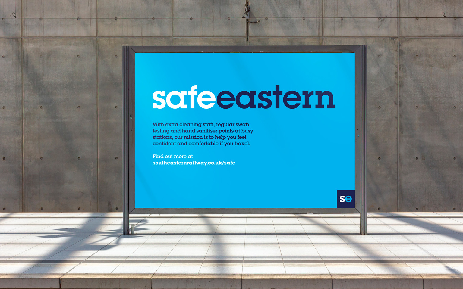
Bringing Southeastern and safety together as ‘Safeeastern’ places safety right at the heart of the brand.
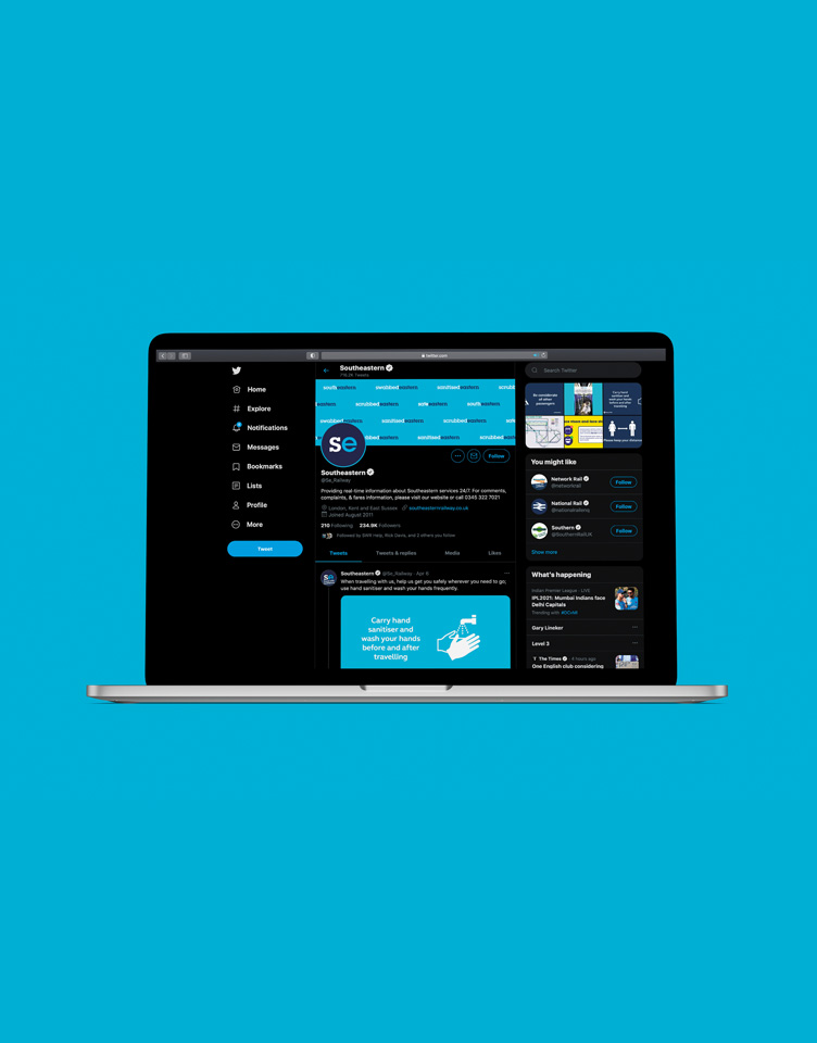
Work
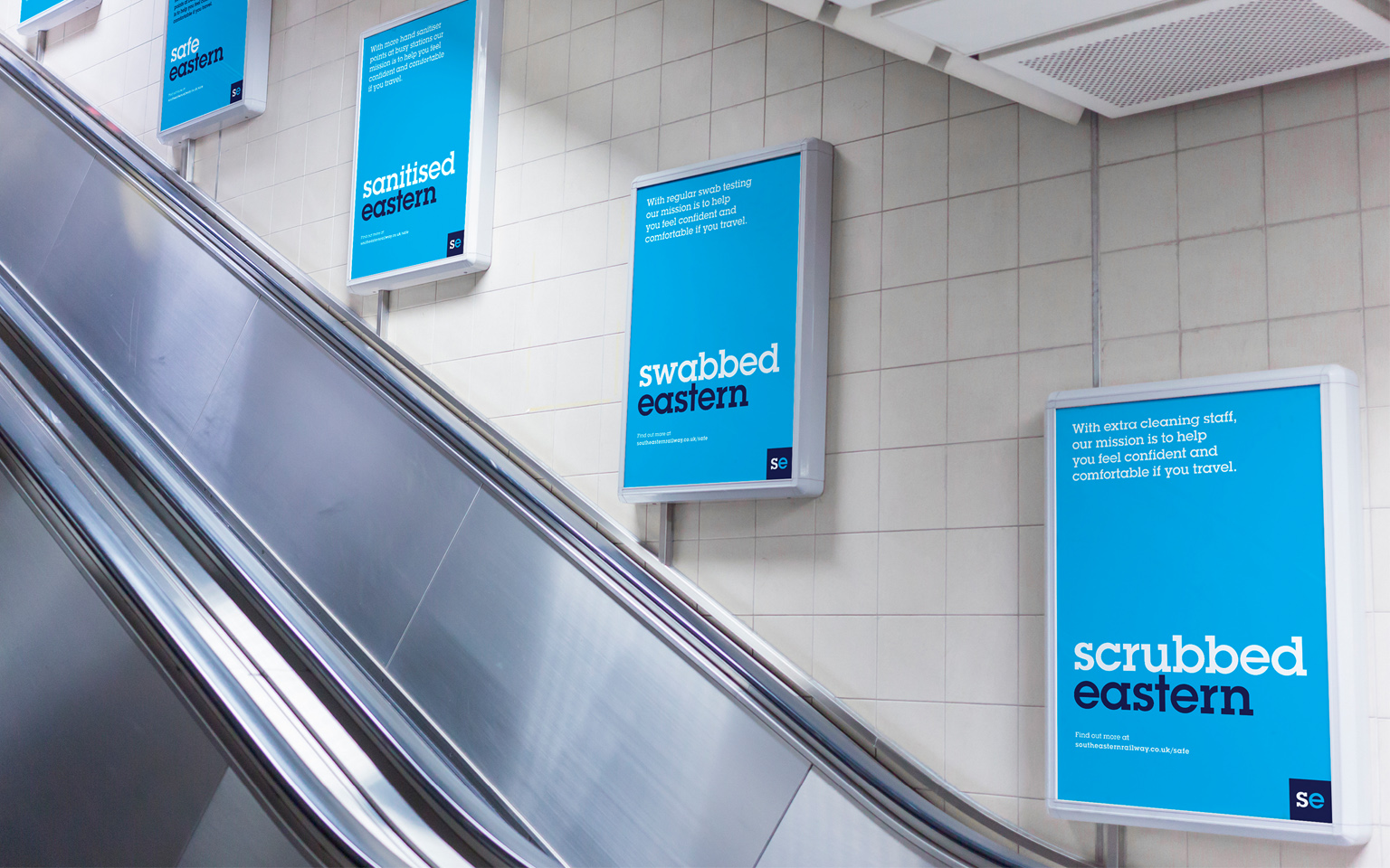
Our mission was to help passengers feel confident and comfortable while travelling. The campaign raised awareness of the extra cleaning staff, regular swab testing and hand sanitiser points installed at busy stations to reassure passengers that the train company was doing everything possible to make their stations Covid-secure.
The visual expression for the campaign uses a simple tweak of the logo to drive home that safety is, and has always been, right at the heart of the Southeastern brand. Using typography as opposed to lifestyle imagery emphasised the gravitas and reassuring tone of the message we needed to deliver. The instantly recognisable font and colour pallet also gave us great cut-through in a typically comms heavy environment.
The campaign went live in February, across radio, station posters, and digital.
More Case Studies
ICAEW
Positioning the ACA as the complete qualification for tomorrow’s finance leaders

Gas Safe Register
A campaign to save lives

Creating Values for Genius Sports
Getting the language right
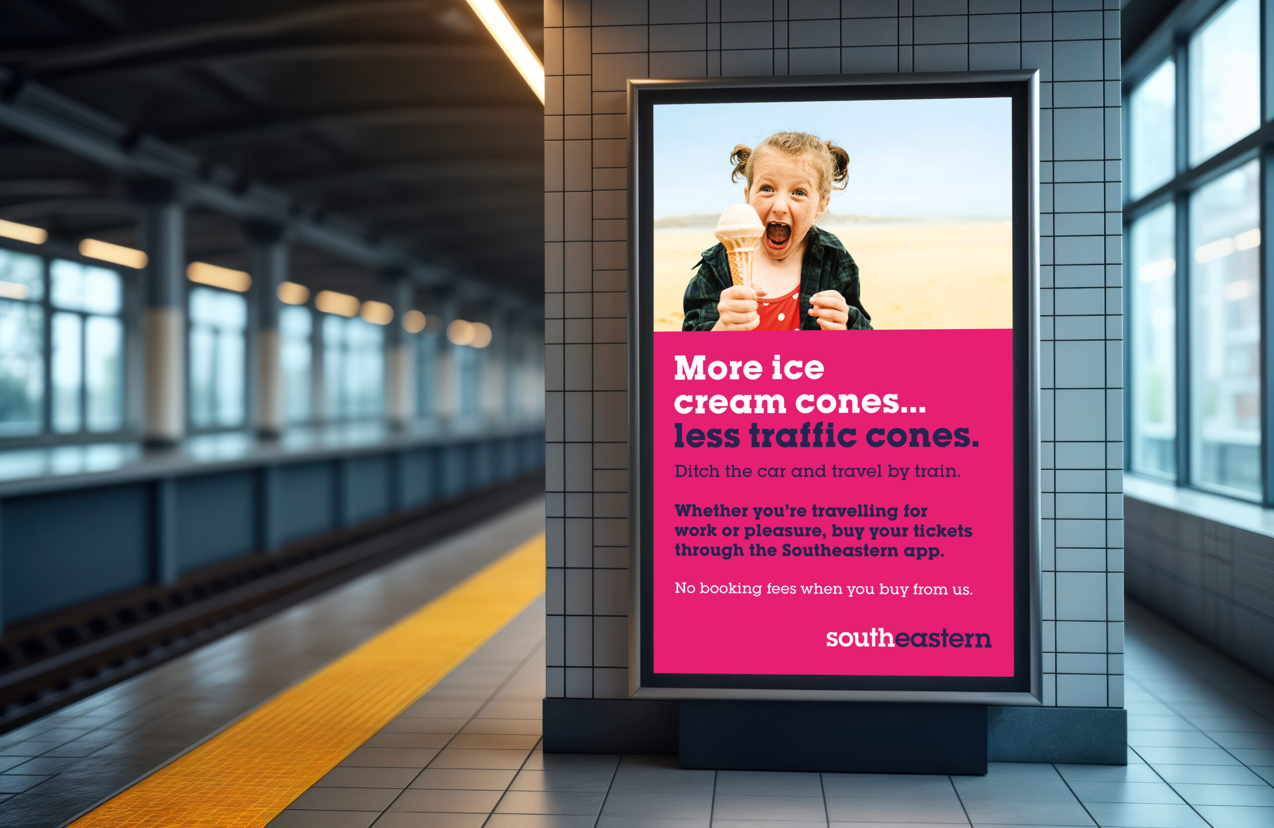
Southeastern modal shift
Promoting a greener way to travel with Southeastern