Sovereign Housing Association
A brave, bold and modern brand identity
Challenge
Sovereign is a leading housing association that puts customer service at the centre of their work. In 2019, they made the strategic decision to refresh their brand and better express their social purpose, as well as to connect, unify and reflect the association’s reinforced strength, efficiency and scale.
Our challenge was to create a brand identity system, architecture and positioning that presented Sovereign as a modern, connected business with a fresh perspective on social housing. The brand’s visual identity had to work on both digital and offline platforms, and echo their renewed ambition to create a truly customer-centric brand.
We create a value proposition built around creating spaces where people love to live.
Play the film ^
Approach
• We used market analysis, customer insight, and brand audit results to get under the skin of the organisation, working collaboratively with Sovereign.
• Our discovery phase was bolstered with site visits to learn more about how the housing association interacted with its customers, and we carried out customer and stakeholder interviews to identify pinch points and examples of where Sovereign excelled in its customer service.
This insight enabled us to develop a value proposition; brand framework and refreshed brand identity.
See the logo ^
Strategy
Data and insight proved pivotal to our process and final visual identity. It was clear from our market analysis that certain colourways dominated the industry. If Sovereign were to ‘reimagine housing’, then their brand would also need to stand out visually from the crowd.
We identified four brand territories and created an ambitious platform to highlight the differentiators that set Sovereign apart from other housing associations.
Sovereign operates separate customer and corporate websites, as well as an intranet. The brand design system had to be flexible to work consistently with different audiences and content types.
A series of design sprints were held to move the brand platform into clearly defined visual territories. This allowed us to take key stakeholders on the journey, testing and evolving the brand elements at regular intervals.

Work
We created the brand concept ‘Reimagining housing’ – a call to action that signalled the change in Sovereign.
We took a fresh perspective on Sovereign’s logo, creating a symbol made of two dynamic shapes to reflect the movement and energy of the business.
We tested different colour options with research groups and, ultimately, a focus on black and white, with a supporting palette of fresh, bold colours, was selected.
We also identified a new primary and secondary typeface, photography guidelines, icons and pictogram styles, and designed a number of indicative applications to express the overall brand essence.
The design system was then flexed to work across their main website, customer portal, corporate website and intranet, so that each site aligned seamlessly with the new look and feel. Once the full design system was created, we provided the brand owners with a series of training sessions to ensure they could continue to roll the brand out through the business.
The brand design system was created to ensure continuity across the different digital touchpoints to make the user experience consistent at all times.
More Case Studies
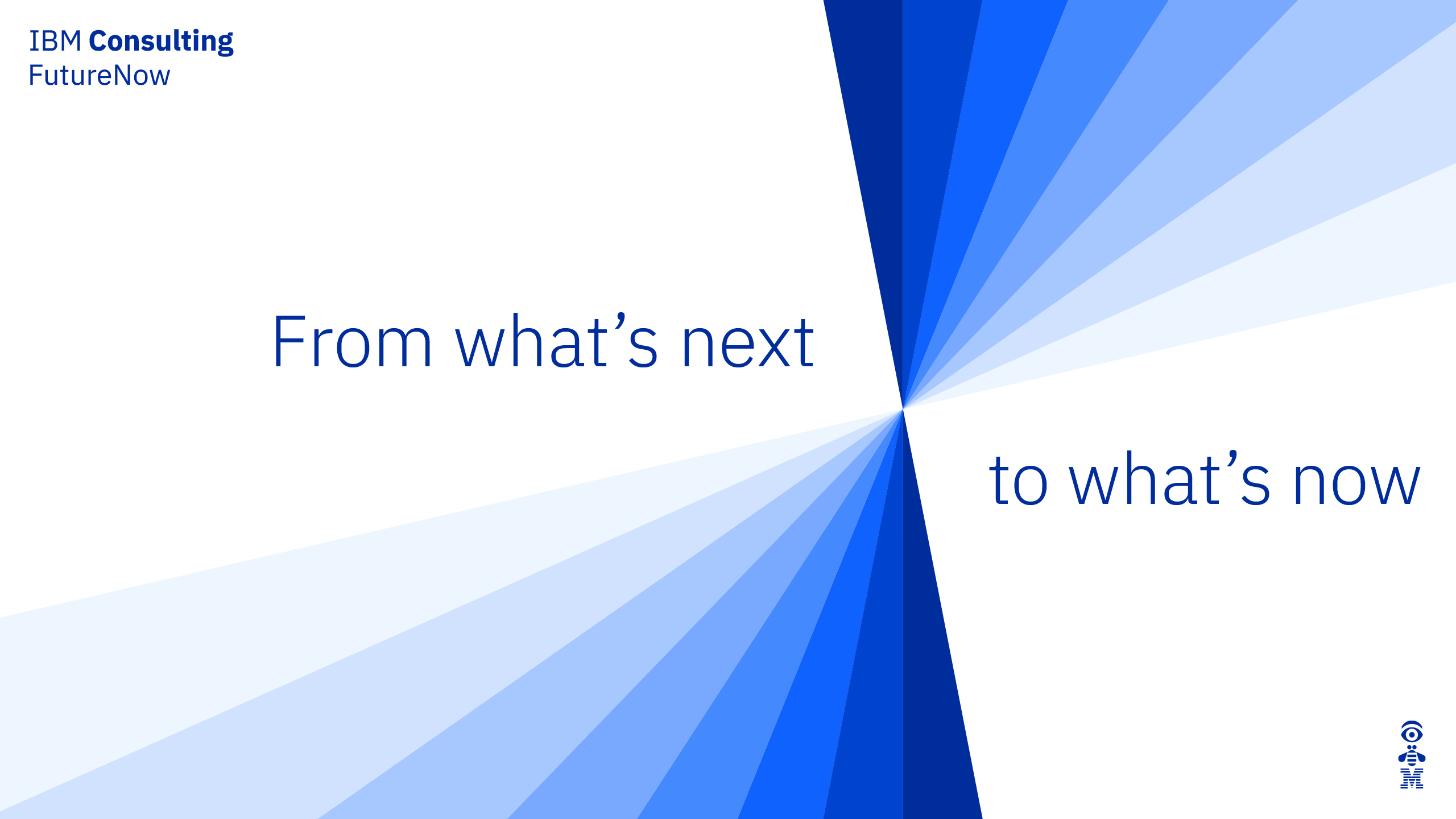
IBM Consulting
Repositioning and creating brand value for IBM
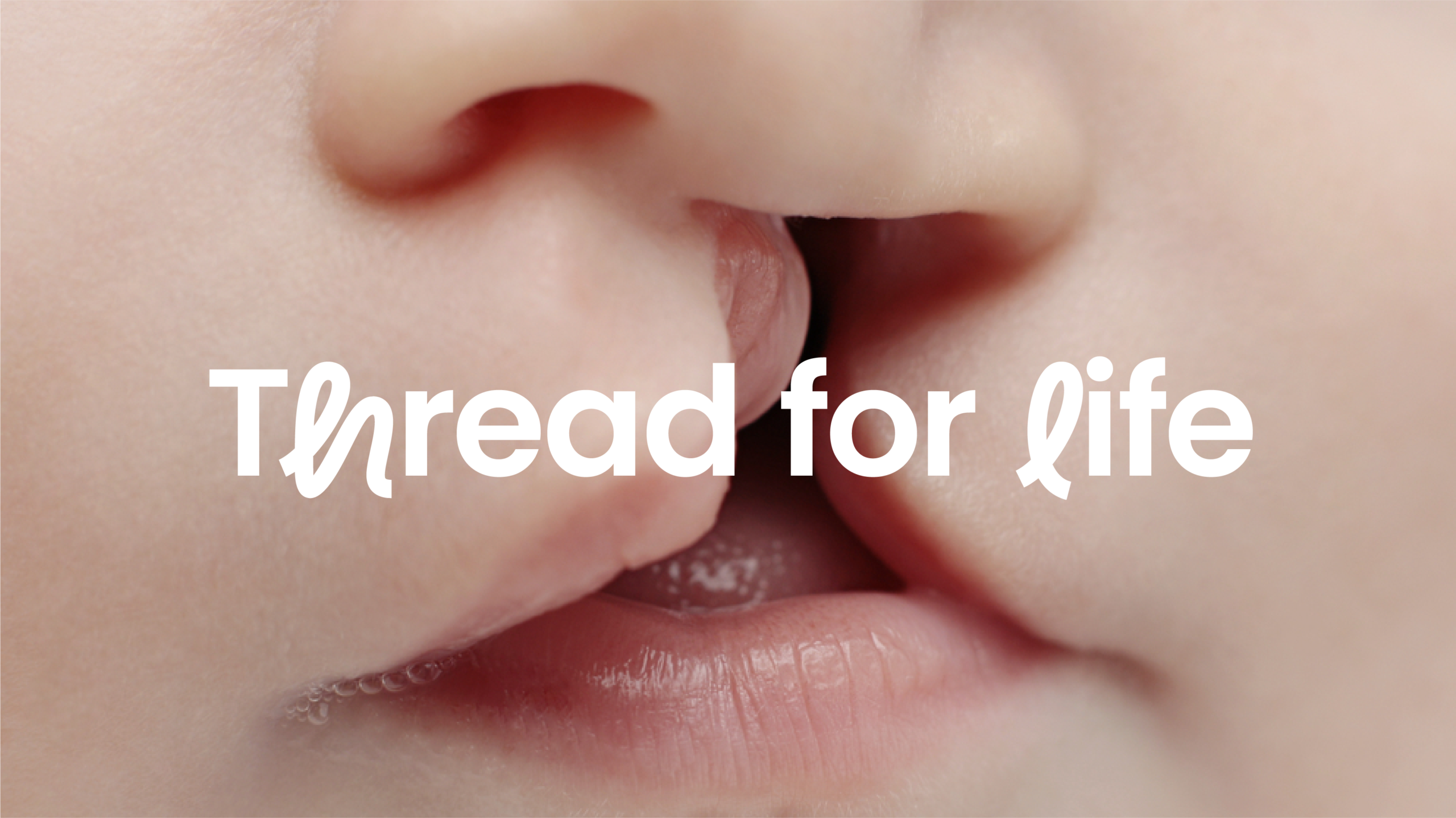
CLAPA
Redefining the voice of the UK cleft community