Elevating Brand Storytelling with Motion Design

Our motion design work with Frontier, Sands, NATS and NS&I
Rhythm and emotional pacing
Think of the rhythm of animation timing like the beat of a song. Marrying motion to rhythm can amplify emotion. Motion set to a slow pulse can make a sequence feel grand and powerful. A playful, bouncy rhythm speaks to fun and spontaneity, while linear, steady motion can imply seriousness and trustworthiness.
Motion designers choose these tempos intentionally. A teeming city skyline might zoom forward rapidly to energise, whereas a scene about heritage might pan slowly to honour tradition. In each case, viewers feel the brand’s personality through motion.
This film for Frontier uses elemental motion behaviours to tell their brand story. Seeds in the wind, overlapping organic shapes, and constant growth.
Meaningful transitions and metaphor
Transitions in motion graphics are more than fancy wipes; they tell a micro-story of their own. A shape morphing into another can connect two ideas. A slow fade to black might signal an epilogue or major shift in narrative tone, while a quick whip-pan can leap to a moment of excitement or surprise.
These editorial choices guide the audience’s emotional journey which starts in storyboarding. In practice, a brand animation introducing a partnership might slide two logos toward each other, symbolising collaboration.
This logo animation for Sands needed a soft, human touch to express the idea behind the logo.
Equally, visual metaphor in motion can translate abstract brand concepts into tangible images. Animators use visual metaphors as storytelling shortcuts. In motion branding, you might show a seed growing into a tree to represent sustainability or a rising sun to represent new beginnings. The key is choosing metaphors that resonate with your audience’s intuitive understanding. When done well, a single animated sequence can encapsulate a complex idea without a word of text, making the message immediate and memorable.
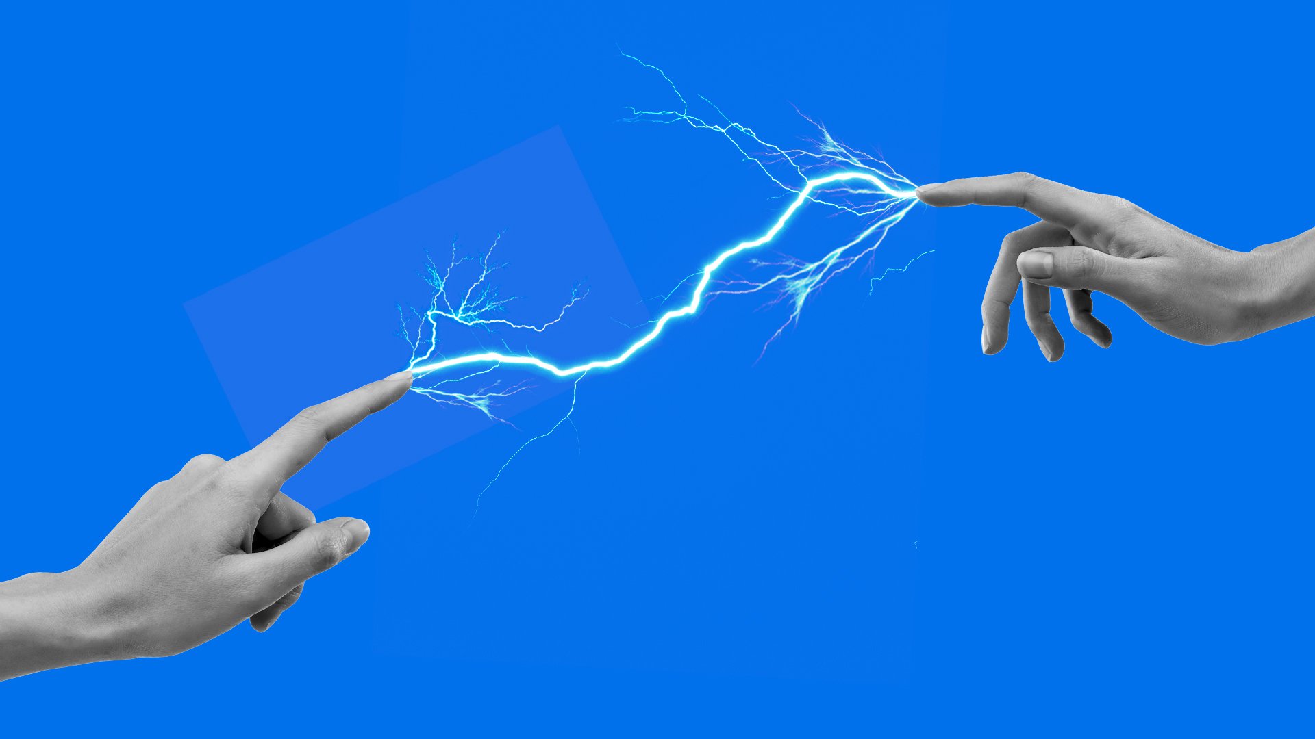
The motion here for NATS conveys a sense of flight as abstract arcs soar across the screen to reveal the logo.
All-in-all
Motion design can easily be viewed as “editorial design in motion”. Every animated element plays a role in the narrative, not just a pretty curlicue. A good motion sequence is comparable to choreography or music: it has beats, motifs, crescendos. Brands that thoughtfully craft rhythms, transitions, and metaphors in their animations end up speaking directly to viewers’ emotions.
When motion is treated as a language (with grammar and style) rather than a gimmick, it elevates the entire brand story and makes each frame an act that means something.