The art of wayfinding is not to get in the way

Wayfinding is simply user experience design within a built environment. Helping others to orientate themselves, choose a path, keep on track and complete a journey. Designing a visual language that guides users from place to place. This article looks at how wayfinding plays a critical part in setting expectations and managing behaviour.
If people are confused, feeling held back or misled then the design of a signage system has failed. Sure, sometimes you may want to go big and grab their attention or deliberately slow traffic and create decision points. Generally, you’ll simply want to help people along their way. Guide them to make simple choices. Most people don’t recognise that their path has been designed until they are missing a sign or there’s an unexpected change in the environment.
As a designer it’s hard to switch off. Seeing graphics in situ, ‘in the wild’ rather than beautifully photographed for Pinterest, puts me in a constant state of questioning. Thinking about sight lines, orientation and movement through a space. Why is that there? That isn’t clear, that could be misread, that doesn’t work at night, etc. And don’t get me started on bad typography or ambiguous symbols. It’s not about aesthetics; having order and logic makes sense. When we are on the move we need things to be very obvious and easy.
Millions of passengers coupled with the mix of languages, cultures and disabilities make airports particularly challenging. I’ve been working with airports for many years, on retail, security and employee engagement projects. What I’ve learnt is that wayfinding plays a critical part in setting expectations and managing behaviour.

Designing security systems at Heathrow
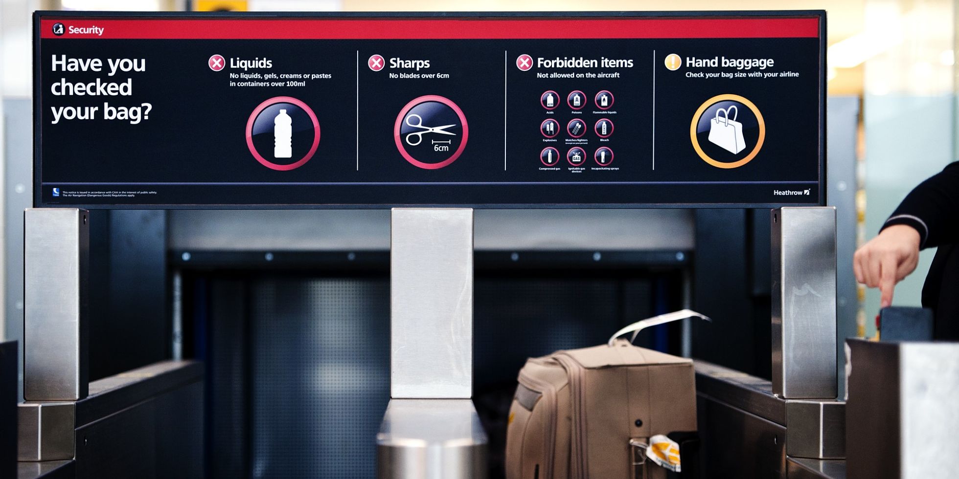
When the government decided that hand luggage would be subject to security restrictions at airports, people started asking; How much is 100ml? Is toothpaste OK? What about scissors? Yet, many remained unsure, still turning up with bottles of drinks and shampoo that were too large.
While foreign visitors and UK residents had due respect for our border controls at arrival, they were less compliant when departing.
For Heathrow, queues weren’t getting shorter and staff were overstretched. Hand luggage remained an issue of security and it was becoming clear that security messages were getting lost amongst existing wayfinding.

Coincidently I had worked with the Home Office to create the brand for the UK Border Agency. Finding a visual language which would set the right tone. Attracting and welcoming visitors to the UK, whilst taking effective action against those who break the rules. The question for Heathrow was if their brand was flexible enough to do both without compromising the many other aspects of the airport experience.
So, we discussed what was the job to be done with Heathrow’s Head of Brand, Marketing & Insight. And began to find our way together. To get started, I like to answer simple open-ended questions:
Who? Putting the user at the centre.
Why? The reason something exists, is done or created. Its purpose.
How? The culture, tone and personality.
What? The features and usability.
When and where? Going to market today and planning for tomorrow.
Who?
Heathrow is Europe’s busiest international airport, connecting to 194 destinations worldwide in 82 countries. In 2017, the airport carried 78 million passengers.
To the passenger, the airport experience is seen as integral to their trip, unaware that their whole experience is the sum total of different stakeholders from airline, airport, ground handlers, security and officials, all working together in a defined, physical and technological environment and infrastructure to deliver a seamless passenger flow.
To help shape passenger expectations and reinforce good behaviour. We were mindful of staff, retail partners, the media and government. And consulted these groups at key points throughout the project.

Why
Heathrow’s purpose is simple: “We’re here to help our passengers get to where they want to be, as smoothly and swiftly as possible.”
To help passengers appreciate why security measures are in place, we explored three different territories: safety, protection and surveillance.
How?
Based on these territories we explored what a change in tone would mean for the passenger experience and the impact it would have on the Heathrow brand. Using mood boards, we explored with different colourways, graphics and materials to form an overarching look and feel.


What?
We tested two different design options at Heathrow in a live situation. Using the north gate of Terminal 5 for option one (red route) and the south gate for option two (blue route). We observed how people behaved – the red route proved more effective and is what you’ll still see today. The simple traffic light system (Red = Stop, Amber = Seek Advice, Green = Proceed) being understandable in any language.


Here are some of the comments we received from users:
- The blue doesn’t seem to be noticeable – the red stands out much better.
- Red is much clearer and more severe… severe is right. I work in a nuclear power plant – I’m used to this stuff.
- The red one is scarier – like “hey look at this”.
- Red option is great. The blue option is too asleep.
- The blue is friendlier. The red is telling you you’ve done something wrong… but I guess you’d pay attention to it.
- Blue is much calmer and friendlier. The red and black is like something out of 1984.
- The blue’s nicer – it’s not so “in your face”.
- The blue is more effective because it’s different. The red one is just another thing that I can’t do.
The testing was so popular with staff that the temporary graphics remained in place until the final wayfinding system was delivered.

Where and when?
While mapping the passenger journey, we identified touch points and created a flexible system to adapt to the different environments and specific requirements at each stage of the journey. The work we did became an integral part of staff training.
People buy tickets online
People consult the Heathrow website for information. Airlines send e-ticket confirmation; some have membership databases; people also consult airline website for information.
Orientation Moments
Points in the journey when the passenger naturally stops, e.g. getting out of the car, arriving at the bus stop, arriving at the station platform. Their attention span here is short.
Pinch Points
Points in the journey where the passenger is on the move and where the opportunity for communication is reduced to a few seconds. Communication should be limited, and clarity is of the upmost importance.
High-Visibility Points
Opportunities to maximise space in large environments and spaces where passengers are looking up or looking around in search for the next destination. Check-in zones, travelators, escalators, doorways (including all drop-off points), all entrances to buildings from travelators and carparks where corridors narrow.
Pause Points
Places where passengers are queuing or waiting and about to embark on a process to enable their flow through a part of the airport. Their attention span is higher here. All check-in areas, baggage re-packing and ticket presentation. At restaurants, shops and seating areas (especially where people can buy liquids or bags).

Results:
95% of passengers now experience queue times to under five minutes.
24% more passengers understood the rules for taking liquids onto aeroplanes.
This has impacted the number of people confidently buying liquids in airside duty free shops, and equates to a potential £9 million in potential sales revenue.
Technology and security checks have evolved over the past few years, but our design is still working. Flying through other international airports I’ve seen that the traffic light system has been imitated. There’s a satisfaction knowing that a wayfinding solution has been effective. Especially when most people don’t realise they’ve been nudged by design.
To find out more about our approach to wayfinding or using design thinking to tackle behaviour change please get in touch.


