Colour me happy

In our accessibility blog series, we look at how to test the limits and push the boundaries in the ambition of achieving inspirational design. Clare Wilson, Creative Lead at The Team, looks at the colour accessibility principles to follow to ensure a brand is accessible to all audiences.
We all see colour slightly differently and our perception is ‘coloured’ by the context in which we view it. People with colour vision deficiency find it difficult to identify and distinguish between certain colours, particularly shades of red, yellow and green. This is known as “red-green” colour vision deficiency. It’s a common problem that affects around 1 in 12 men and 1 in 200 women. However, the contrast between colour values and between hues affects how all viewers experience print design.
We’ve put a list of colour accessibility principles together to help ensure your design is accessible to all audiences.
Colour palette
How do you select a set of colours that express your brand, complement one another, and pass accessibility standards?
Who a brand is will dictate which colours, tones, combinations and proportions to use. We suggest sitting down and reviewing your brand’s goals, personality and attitudes to build an initial hypothesis in your mind. Research your competitors to identify the norm and find the gaps to separate you from the competition. When you really tap into who your brand is, the colours to use will become clear. We use Adobe’s colour scheme generator to help build colour themes. When you have your colour palette, test it for accessibility.
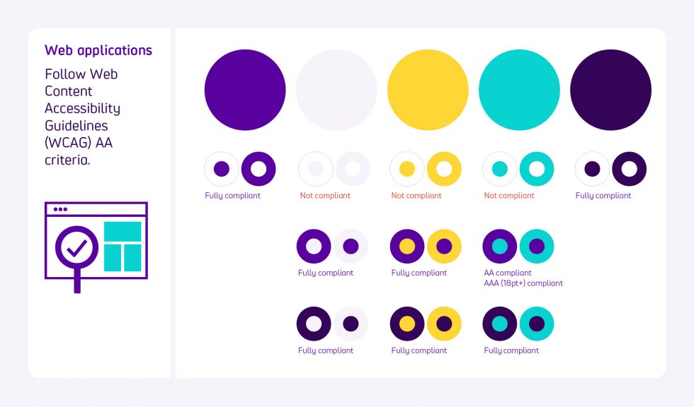
We advise you select a ‘hero colour’ with a cast of accessible supporting colours. The colours should be able to be used in combination. It is best to test each colour combination to see whether or not they are accessible.
Finally, test it on sample applications to make sure your colours work well in context.

Colour contrast
Colour contrast between text and background is important as it affects some people’s ability to perceive information.
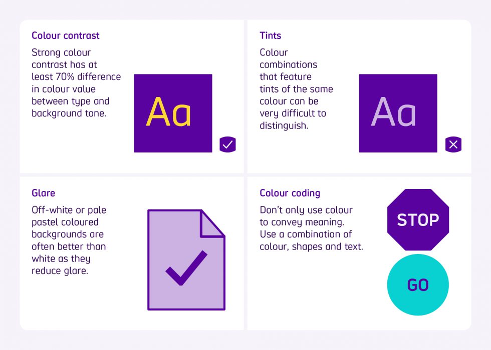
A good colour contrast has at least 70% difference in colour value between type and background tone. A strong contrast is particularly important at a distance, for example in signage.
Tints
We suggest avoiding colour combinations that feature tints of the same colour as they can be very difficult to distinguish.
Colour coding
Don’t only use colour to convey meaning. It is best to use a combination of colour, shapes and text to convey meaning to your audience.
Be aware of cultural connotations and colour choices. If you make a poor colour choice, without properly doing your research, your design could be saying something it doesn’t intend to or at worse offend your audience. How a colour is perceived depends a lot on a person’s culture. Red is associated with good luck in China but symbolises mourning in South Africa. The colour white is associated with unhappiness in India but symbolises peace in Western cultures.
Glare
Avoid black text on a white background. Off-white or pale pastel coloured backgrounds are better as they reduce glare. However, this does differ from person to person, so adaptability is helpful.

Web applications
It is essential to follow Web Content Accessibility Guidelines (WCAG) AA criteria to ensure web content is more accessible.
Get in contact with us on how you can evolve your brand and push the boundaries of accessible design.
Scope’s new visual identity, developed by The Team in collaboration with Scope, uses accessible design to inspire a movement – to end disability inequality and achieve everyday equality for every disabled person. Take a peek at this new game-changing brand.
Download our inclusive design poster – designing with accessibility in mind


