Top tips on how to achieve easy-to-navigate layouts
In our ambition to test the limits and push the boundaries of accessible design, we look at the design and layout principles to follow.
Well-organised content laid out in a linear, logical design helps users orientate themselves and navigate through the content effectively. We provide tips on how to achieve an accessible design and layout in documents and on web pages.
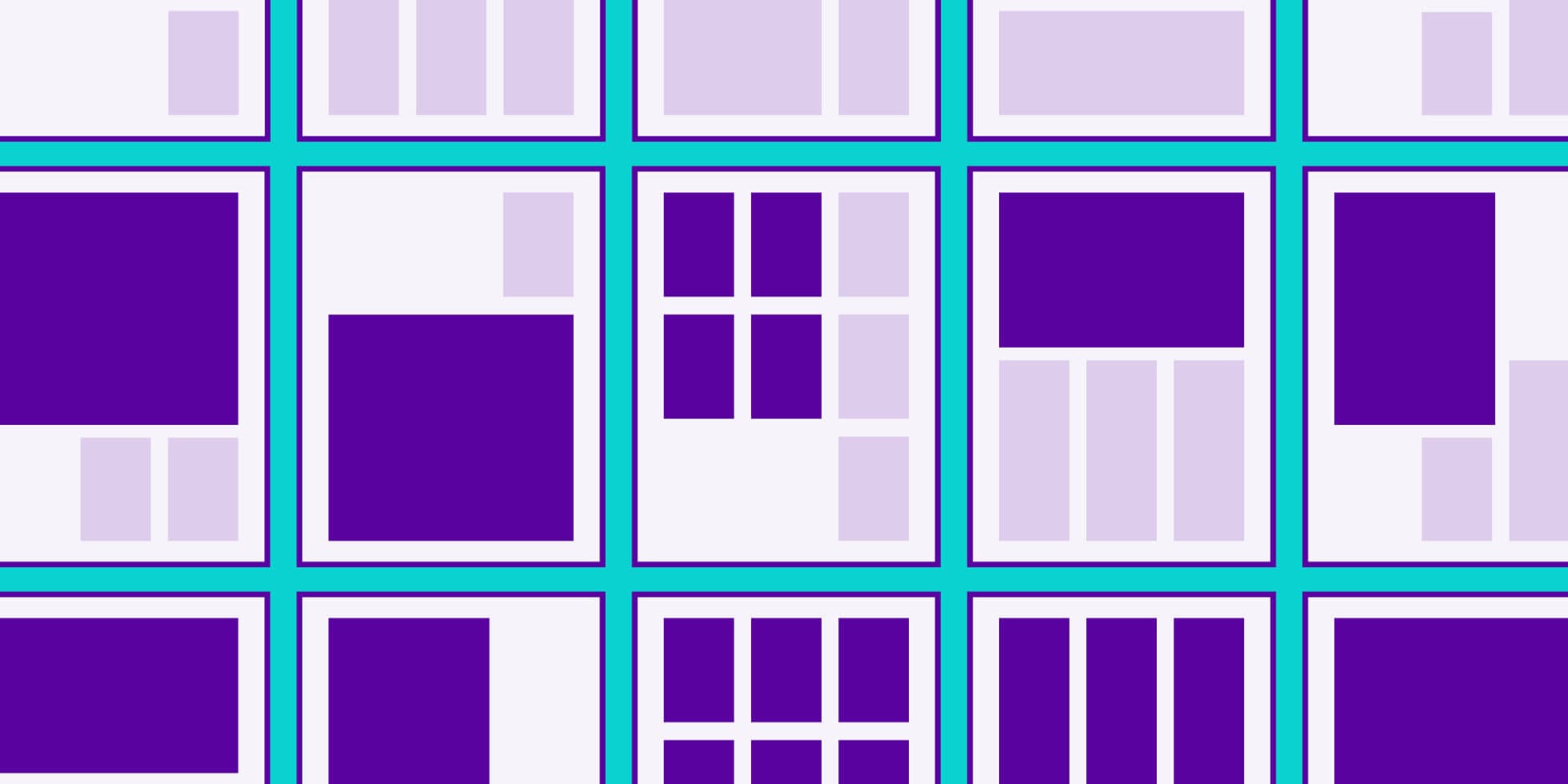
Grid
- Use a consistent grid in your layout to create a structure.
- It is best to use a linear, logical layout making it easy for a reader to navigate their way through the content.

Content
- Don’t put too much information in one place.
- Don’t spread content all over a page.
- Don’t make users read long blocks of text.
- Align text to the left and keep a consistent layout.
- Use short sentences, bullet-pointed lists and tables to break up long passages.
- Break up content with headings and subheadings, images and videos.
- For web readers, structure content using HTML5.

Text on an image
- Don’t put text across images or photographs.
- Images or photographs conveying information not covered in the main text must have a text description sitting in a text box or holding shape.

Tables
- Tables should have a uniform structure with no merged cells.

Column width
- Don’t have more than two columns of text on a page.
- Use a comfortable column width that is neither too wide nor too narrow.

Words per line
- Don’t use more than 60–70 letters per line (around 12–16 words per line).

Larger documents
- If the document is over one page in length, use page numbers and break information down into sections using subtitles.
- For larger documents over six pages, provide a contents list and executive summary.
- Use colour coding as a navigation aid and an alternative method to portray information.

Scope’s new visual identity, developed by The Team in collaboration with Scope, uses accessible design to inspire a movement – to end disability inequality and achieve everyday equality for every disabled person. Take a peek at this new game-changing brand!
Contact us to learn how you can evolve your brand and push it limits to adhere to accessible design.
Download our inclusive design poster – designing with accessibility in mind