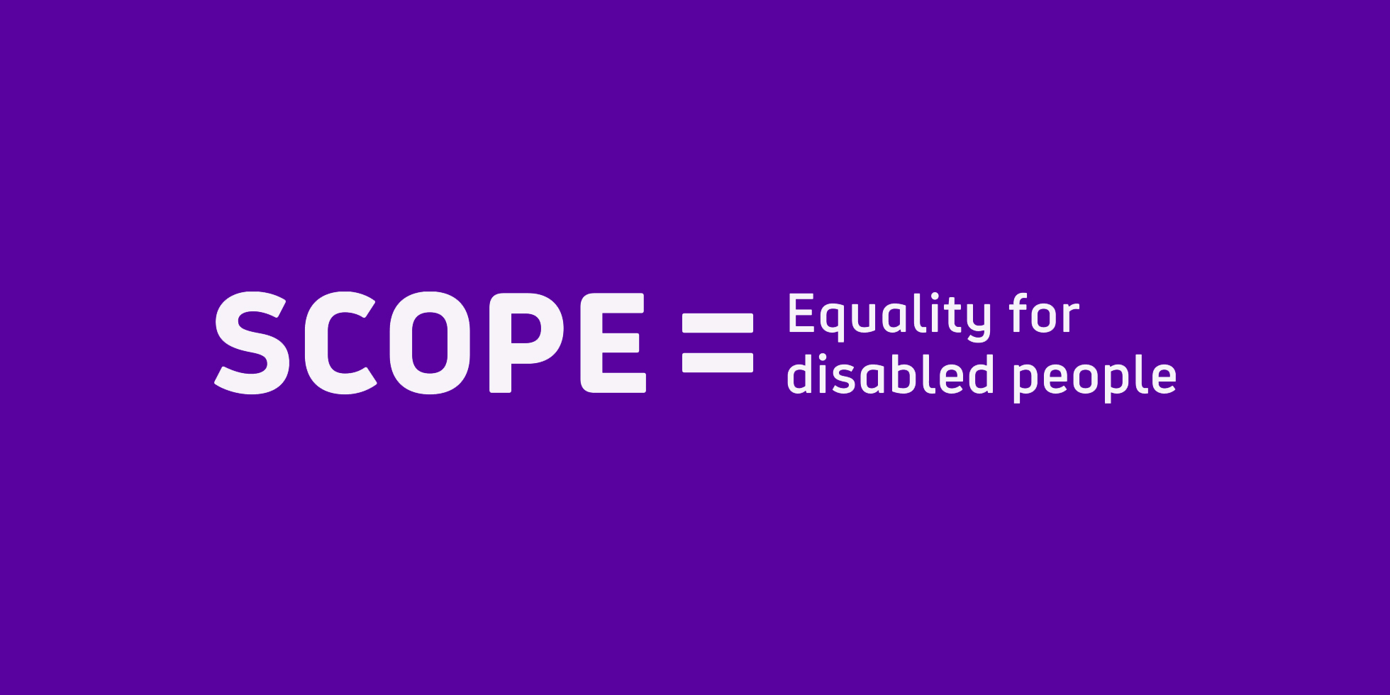
Championing accessible design and disability equality
The new Scope visual identity, developed by The Team in collaboration with Scope, uses accessible design to inspire a movement. Our 9-part accessibility blog series discusses designing all the elements of a brand with accessibility in mind to achieve inspirational design applicable to all audiences.
Over the years I have been fortunate enough to work on a multitude of brands with purpose. I have gone on to become a loyal brand advocate of some and still support them regularly, such as Parkinson’s UK and Blue Cross. I’ve sadly lost faith in others, mentioning no names. But there are few projects I am as proud of as the rebrand of Scope. Here’s why.
The London 2012 Paralympics shifted perceptions of disability by taking on a challenger brand mentality. For the first time it was going to be as good as, if not better than, the Olympics. This was turbocharged by Channel 4’s spine-tingling Meet the Superhumans campaign.
We’re seeing disability represented more than ever before in the media, sport and on TV. And among the public, support for disabled people has never been greater. Nevertheless, disabled people continue to experience serious disadvantages. They are twice as likely to be unemployed. Getting support is a struggle. The cost of living is higher. Life is hard, and the challenges are real. It’s wrong.
I have long hoped for a charity brand to capture the zeitgeist and create a social movement to achieve equality for disabled people, and that time is now for Scope.
Think like a start-up
Our Scope mission started with a brief from Lisa Quinlan-Rahma, Executive Director of Customer Strategy and Experience, to run a one-day workshop for Scope’s leadership team on what life would look like if they were a start-up. A smashing idea that we wished we’d come up with ourselves, so we happily obliged. Many of the workshop tasks that we created came from the basis of our popular Brand DNA Workshops which help brands define their Social Purpose. The result was a brand strategy for the start-up, and a seed sown for what Scope could become.
Brand clarity
The National Spastics Society was founded by three parents and a social worker in 1952, who wanted disabled children to have equal rights to an education. In 1994 the charity became Scope. Whilst well-known for its high street presence, Scope has struggled to communicate what it stands for and is still often associated with cerebral palsy.
One in five people in England and Wales are disabled, which often isn’t visible. That’s 14 million people. The truth is that life is harder when you’re disabled. As a result, in 2017 Scope set out an ambitious new corporate strategy to work towards the UK being a country in which disabled people and their families enjoy equality and fairness.
The simple human truth (73% of disabled people feel there is prejudice against them) inspired the brand strategy, and new vision, mission and values, which in turn inspired a new visual identity and tone of voice.
Accessible design
There was never any doubt that the brand needed to have accessibility at its heart. One of our fears was that the pursuit of accessibility might compromise the brand’s personality, however, we were determined that this wouldn’t be the case.
We kick-started the design stage with a workshop with people with various visual impairments to find out what would worked best for them. This busted myths such as black on white being the most accessible colourway or that Arial is the best font to use.
We wanted to ensure that an accessibly designed brand could still have a distinctive personality.

Design sprints
We created Scope’s new identity and tone of voice in a collaborative two-week “design sprint” with designers from Scope’s internal team, and have applied the same successful methodology to work we have completed for Stroke Association and Bowel Cancer UK.
In the first week we explored and agreed the elements that made up the visual identity and translated the values into tone of voice principles. In the second week we applied the new branding to key collateral to demonstrate it could work effectively for different audience segments and purposes, from services marketing, to policy and campaigns and different forms of fundraising.
“Working with The Team on our brand overhaul has been a huge success for Scope and a pleasure in the process too. Their quick understanding of our unique brand challenges was impressive from the offset. The commitment and talent across all teams is felt at all stages of a project and delivers results. Thanks to The Team we have a truly game-changing brand for our sector.” – Danielle Wootton, Head of Brand and Marketing, Scope

Stronger together
This is a project where the result is stronger because of a close client and agency relationship built on trust and respect for each other’s expertise. A true team collaboration.
Our accessibility blog series looks at elements that make up a brand, how to design these elements accessibly and how accessible design was applied in the co-creation of the Scope brand. As the household spend of disabled people amounts to more than £240 billion a year, it is now more important than ever that third sector and commercial businesses design accessibly for all audiences.
“We’ve brought clarity to what Scope stands for and created an accessible brand, without compromising personality, to ignite a social movement. The vibrant visual and verbal identity positively disrupts the charity sector and stands out amongst a sea of tea and sympathy. The 1 in 5 of us who are disabled don’t want sympathy or negativity. They want a positive ‘can-do’ attitude, collective action and social change.” – Dan Dufour, Brand Strategy Director, The Team
Download our inclusive design poster – designing with accessibility in mind